
3:16 a.m.
#180: ABRT2 gui review
--------------------------------------+-------------------------------------
Reporter: jmoskovc | Owner: nobody
Type: task | Status: new
Priority: major | Component: Interaction Design / Usability
Severity: Long-Term / Complex Issue | Keywords:
--------------------------------------+-------------------------------------
The old ABRT gui doesn't work for new the features so we changed it and
now it really needs some love from someone who understands UIs ;) The new
UI can be seen in F15. Please let me know if some explanation/process
description is needed.
Thank you.
--
Ticket URL: <https://fedorahosted.org/design-team/ticket/180>
Design Team <http://fedoraproject.org/wiki/Design>
Fedora Design Team
11:38 p.m.
#180: ABRT2 gui review
---------------------------------+------------------------------------------
Reporter: jmoskovc | Owner: kirkb
Type: usability assessment | Status: assigned
Priority: major | Component: Interaction Design / Usability
Severity: Moderately Involved | Resolution:
Keywords: |
---------------------------------+------------------------------------------
Changes (by kirkb):
* owner: nobody => kirkb
* status: new => assigned
* type: task => usability assessment
* severity: Long-Term / Complex Issue => Moderately Involved
Comment:
I'm happy to help with this - do you think I can just download the latest
Fedora 15 in a VM and review the interface there? Are there specific
parts of it that you'd like to focus on or is this just an overall review?
--
Ticket URL: <https://fedorahosted.org/design-team/ticket/180#comment:1>
Design Team <http://fedoraproject.org/wiki/Design>
Fedora Design Team
12:29 a.m.
#180: ABRT2 gui review
---------------------------------+------------------------------------------
Reporter: jmoskovc | Owner: kirkb
Type: usability assessment | Status: assigned
Priority: major | Component: Interaction Design / Usability
Severity: Moderately Involved | Resolution:
Keywords: |
---------------------------------+------------------------------------------
Comment (by kirkb):
I just tried to check it out in the Fedora beta and see version 1.1.17,
which is the same version as the one I see in my Fedora 14 desktop. What
version should I be looking at?
--
Ticket URL: <https://fedorahosted.org/design-team/ticket/180#comment:2>
Design Team <http://fedoraproject.org/wiki/Design>
Fedora Design Team
2:50 a.m.
#180: ABRT2 gui review
---------------------------------+------------------------------------------
Reporter: jmoskovc | Owner: kirkb
Type: usability assessment | Status: assigned
Priority: major | Component: Interaction Design / Usability
Severity: Moderately Involved | Resolution:
Keywords: |
---------------------------------+------------------------------------------
Comment (by jmoskovc):
Replying to [comment:2 kirkb]:
I just tried to check it out in the Fedora beta and see version
1.1.17,
which is the same version as the one I see in my Fedora 14 desktop. What
version should I be looking at?
Hi,
the new version 2.0.x is only in F15.
--
Ticket URL: <https://fedorahosted.org/design-team/ticket/180#comment:3>
Design Team <http://fedoraproject.org/wiki/Design>
Fedora Design Team
10:10 a.m.
#180: ABRT2 gui review
---------------------------------+------------------------------------------
Reporter: jmoskovc | Owner: kirkb
Type: usability assessment | Status: assigned
Priority: major | Component: Interaction Design / Usability
Severity: Moderately Involved | Resolution:
Keywords: |
---------------------------------+------------------------------------------
Comment (by kirkb):
Replying to [comment:3 jmoskovc]:
Replying to [comment:2 kirkb]:
> I just tried to check it out in the Fedora beta and see version
1.1.17, which is the same version as the one I see in my Fedora 14
desktop. What version should I be looking at?
Hi,
the new version 2.0.x is only in F15.
Oops, the F15 beta download has 313 updates available, including abrt 2.x.
I'll update the system and get going on this.
What kind of timeline, if any, would you like this to be done by? You set
the priority as major.
--
Ticket URL: <https://fedorahosted.org/design-team/ticket/180#comment:4>
Design Team <http://fedoraproject.org/wiki/Design>
Fedora Design Team
5:46 a.m.
#180: ABRT2 gui review
---------------------------------+------------------------------------------
Reporter: jmoskovc | Owner: kirkb
Type: usability assessment | Status: assigned
Priority: major | Component: Interaction Design / Usability
Severity: Moderately Involved | Resolution:
Keywords: |
---------------------------------+------------------------------------------
Changes (by jmoskovc):
* cc: crash-catcher(a)lists.fedorahosted.org (added)
Comment:
What kind of timeline, if any, would you like this to be done by? You
set the priority as major.
Major was default, so I just left it as it was. And for the timeline -
sooner is better ;) Ok, seriously, we won't make it to F15 anyway, so lets
target F16 which means we should have pretty good idea about the new gui
before end of July so we have enough time to implement required changes.
Does it sound suitable?
--
Ticket URL: <https://fedorahosted.org/design-team/ticket/180#comment:5>
Design Team <http://fedoraproject.org/wiki/Design>
Fedora Design Team
6:08 a.m.
#180: ABRT2 gui review
---------------------------------+------------------------------------------
Reporter: jmoskovc | Owner: kirkb
Type: usability assessment | Status: assigned
Priority: major | Component: Interaction Design / Usability
Severity: Moderately Involved | Resolution:
Keywords: |
---------------------------------+------------------------------------------
Comment (by elad):
Not a designer, just dumping my opinion here:
Basically I think the "wizard" isn't a good approach, it might be a
useful
and powerful UI for advanced users, but scares away newbies.
I think that a window that will simply say "blah blah has crashed", with
the icon of the application (name and icon should be pulled from the
desktop file), and have a text-area for comment, and a text similar to
"Please report this problem! it will only take a few moments and will help
us fix it".
When the user is done writing the comment:
1. If it's the first time, the GUI should ask for bugzilla user name and
password
1. the GUI should also present an option "always use retrace server" -
enabled by default
2. the GUI should present an option "I do not want to verify the
backtrace every time, and I understand that fedora will not be responsible
for any private data that I may send by mistake" - disabled by default.
* That's because the backtrace is not understand-able by beginners and
they probably won't know whether it contains private information or not.
2. After the first time configuration (or if such configuration is not
needed), the window should proceed to the next step - analysing and
reporting.
1. Short, simple, status messages, such as "Gathering data",
"Uploading", "Analysing", "Checking for previous reports",
"Reporting".
2. Should be a small window, with progress bar and status only.
Something like the nautilus file copy window.
3. A button that will expand the window to show more details for
advanced users is fine, but showing the details by default is not a good
idea IMO.
3. When the reporting is done, the window should display the link to the
bug report and a small explanation such as: [[BR]]
"Thank you for your bug report, we really appreciate it. You'll get email
notifications for changes made in the report and for added comments, and
you should help the developers by responding to their questions in the bug
report." (the wording is not so good, but that's the general meaning).
Other nice-to-have UI improvements:
* Packagekit integration. when the user starts reporting a bug, ABRT
could query packagekit to see if there are any updates to the software
that crashed or to the libraries it uses, and recommend the user to update
the package if there is an update available, with text that explains that
the problem might have been fixed by this update. It shouldn't force users
to update though, and should allow reporting even if the package is a bit
outdated.
* Extremely friendly notifications for specific bug status change, for
example, if the bug gets a NEEDINFO flag, a notification should be
displayed to the user, something like "We need some more info to fix your
problem in <application name>" and a link, or, if the bug is closed with
the ERRATA resolution, then a notification should be shown: "We fixed your
bug! thank you for your report. an update with the fix will be available
soon for you".
One might argue that those notifications are not needed because we have
email notifications, well, this is exactly the reason we need those
notifications. take [https://bugzilla.redhat.com/show_bug.cgi?id=539756
bug #539756 ] as an example, it gets a new CC every week, and every one
who ever "reported" this issue using abrt is getting a message for every
new CC, resulting spam that users will quickly "learn" to ignore. So there
are two solutions: either improve bugzilla not to send emails on new abrt
CCs to everyone who was added to the CC by abrt (but do send message for
users who were added to the CC manually), or implement this two simple
status notifications in ABRT. The second one is easier to implement IMO.
* A button ladled "why report bugs?" that will open a web page or a
document with an explanation about the progress and why is it so
important.
--
Ticket URL: <https://fedorahosted.org/design-team/ticket/180#comment:6>
Design Team <http://fedoraproject.org/wiki/Design>
Fedora Design Team
9:12 a.m.
#180: ABRT2 gui review
---------------------------------+------------------------------------------
Reporter: jmoskovc | Owner: kirkb
Type: usability assessment | Status: assigned
Priority: major | Component: Interaction Design / Usability
Severity: Moderately Involved | Resolution:
Keywords: |
---------------------------------+------------------------------------------
Comment (by kirkb):
I'm running through an evaluation and wanted to check two things:
1 - who are your target users with ABRT? Reading through the manual I
think I see two possible user types (desktop users and sys admins). I
wanted to hear from you who you want to design for, and their top 1 or 2
goals. That will help me evaluate the interface.
2 - how would you like to discuss my findings? I can attach a file here
or I can email, meet in IRC, whatever works for you.
--
Ticket URL: <https://fedorahosted.org/design-team/ticket/180#comment:7>
Design Team <http://fedoraproject.org/wiki/Design>
Fedora Design Team
9:37 a.m.
#180: ABRT2 gui review
---------------------------------+------------------------------------------
Reporter: jmoskovc | Owner: kirkb
Type: usability assessment | Status: assigned
Priority: major | Component: Interaction Design / Usability
Severity: Moderately Involved | Resolution:
Keywords: |
---------------------------------+------------------------------------------
Comment (by jmoskovc):
Replying to [comment:7 kirkb]:
We are mainly interested in the GUI designs as it should be easy to use
even for non-experienced users. The CLI is not so important in sense of
"east to use" but would be great if you can give us some hints even for
the CLI.
- the top goals:
* make it really easy to report a bug with meaningful comments (gui
should guide user thru the process of gathering info about the crash)
a. easy way to configure bugzilla account (so the gui should ask if
something is missing, etc..)
a. adding attachments
a. writing comments
I'm running through an evaluation and wanted to check two
things:
1 - who are your target users with ABRT? Reading through the manual I
think I see two possible user types (desktop users and sys admins). I
wanted to hear from you who you want to design for, and their top 1 or 2
goals. That will help me evaluate the interface.
2 - how would you like to discuss my findings? I can attach a file
here
or I can email, meet in IRC, whatever works for you.
- attachment in this ticket works fine for me, or just a link where you
will keep the updated mockups? And the irc can be used for real time
isuues/questions :) I'm on freenode #abrt #fedora almost every day 9am -
9pm CET
Thank you.
--
Ticket URL: <https://fedorahosted.org/design-team/ticket/180#comment:8>
Design Team <http://fedoraproject.org/wiki/Design>
Fedora Design Team
12:31 p.m.
#180: ABRT2 gui review
---------------------------------+------------------------------------------
Reporter: jmoskovc | Owner: kirkb
Type: usability assessment | Status: assigned
Priority: major | Component: Interaction Design / Usability
Severity: Moderately Involved | Resolution:
Keywords: |
---------------------------------+------------------------------------------
Comment (by dmalcolm):
FWIW, I wrote up some notes on the ABRT UI in this bug, though this was
back in the Fedora 12 era:
https://bugzilla.redhat.com/show_bug.cgi?id=555378
(I only just saw this design-team ticket)
In particular, if I may quote myself from that bug (sorry for the self-
indulgence!):
I think the deeper issue here is to decide who the target users of
this
application are. I believe that the design of this application needs to
contain a statement of "personas" describing people who would use the
application; see e.g. http://www.user.com/personas.htm
I believe that the application needs at least three personas:
(a) a persona evoking a non-computerese user of the system,
who's
self-administering the system (e.g. a small businessman using OO.org
spreadsheets who encounters a crash)
(b) a persona evoking a sysadmin who is managing systems on behalf
of
others
(either desktops, or headless servers) and trying to deal with the
problems
they encounter, be it due to bugs in the software,
local/site-specific
issues
(e.g. "their intranet's down"), user-error, or
malicious activity.
(c) a persona evoking the maintainer who's receiving the bug
reports
and
working with (a) and (b).
I hope that by having the above, the design can be informed by things like
privacy concerns on the part of the user ("am I happy having this
information going to this site?") balanced against ease-of-debugging for
package maintainers ("do I have enough information to meaningfully debug
this crash?")
(Probably should think about triaging aspects also: how to deal with the
deluge of crash reports when commonly-encountered crashes happen)
Hope this is helpful
Dave
--
Ticket URL: <https://fedorahosted.org/design-team/ticket/180#comment:9>
Design Team <http://fedoraproject.org/wiki/Design>
Fedora Design Team
1:46 p.m.
#180: ABRT2 gui review
---------------------------------+------------------------------------------
Reporter: jmoskovc | Owner: kirkb
Type: usability assessment | Status: assigned
Priority: major | Component: Interaction Design / Usability
Severity: Moderately Involved | Resolution:
Keywords: |
---------------------------------+------------------------------------------
Comment (by kirkb):
Thanks for the thoughts Dave. In order to keep this simple I'm focusing
on the first persona, without formally defining them. This is taking long
enough without adding in proper persona creation (sorry about the time it
is taking to do this, my free time is in short supply these last few
weeks).
I now have F15 installed and see that the interface has changed somewhat
since I did the initial walkthrough. Some of the changes address a few
points so I'm not restating them. At this point a rough report on the
initial window could be published (rough mind you) but I'm still going
through the submission process and will make some recommendations on those
screens too. Let me know if you want the partially complete report for
discussion or if you'd rather wait for the whole thing.
--
Ticket URL: <https://fedorahosted.org/design-team/ticket/180#comment:10>
Design Team <http://fedoraproject.org/wiki/Design>
Fedora Design Team
3:08 p.m.
#180: ABRT2 gui review
---------------------------------+------------------------------------------
Reporter: jmoskovc | Owner: kirkb
Type: usability assessment | Status: assigned
Priority: major | Component: Interaction Design / Usability
Severity: Moderately Involved | Resolution:
Keywords: |
---------------------------------+------------------------------------------
Comment (by kirkb):
I've attached a draft of the report for the main screen (excuse the less-
than-pretty appearance). I'm wanting to check in with the devs here to
make sure this is the kind of feedback you're looking for, that it is
helpful in understanding the results, and that I should continue with the
remainder of the submission screens in this manner.
If there are other people reading this ticket, any and all feedback on
this is welcome.
--
Ticket URL: <https://fedorahosted.org/design-team/ticket/180#comment:11>
Design Team <http://fedoraproject.org/wiki/Design>
Fedora Design Team
12:27 p.m.
#180: ABRT2 gui review
---------------------------------+------------------------------------------
Reporter: jmoskovc | Owner: kirkb
Type: usability assessment | Status: assigned
Priority: major | Component: Interaction Design / Usability
Severity: Moderately Involved | Resolution:
Keywords: |
---------------------------------+------------------------------------------
Comment (by duffy):
Hi Kirk, I reviewed your draft and so far it looks like a great start! I
talked to Jiri about it today in IRC and he is going to look at it with
his team tomorrow. Great job so far!
--
Ticket URL: <https://fedorahosted.org/design-team/ticket/180#comment:12>
Design Team <http://fedoraproject.org/wiki/Design>
Fedora Design Team
4:51 a.m.
#180: ABRT2 gui review
---------------------------------+------------------------------------------
Reporter: jmoskovc | Owner: kirkb
Type: usability assessment | Status: assigned
Priority: major | Component: Interaction Design / Usability
Severity: Moderately Involved | Resolution:
Keywords: |
---------------------------------+------------------------------------------
Comment (by jmoskovc):
= Menubar =
== File Menu ==
A single item called “Quit” sits in this menu. The HIG suggests that this
menu item be named after the primary object dealt with by the application.
In ABRT's case it seems like “Report” might be a good substitution.
Recommendation: Rename the “File” menu to “Report”
- ok, easy fix, will do
== Edit Menu ==
A single item called “Event Configuration” sits in this menu. This seems
to be similar to the idea of user preferences, but are labeled differently
(consistently in the interface). The term “Event Configuration” does not
feel intuitive to non-technical users (entirely subjective, but as a
somewhat technical user I still think it is oddly named and not entirely
clear). The resulting dialog where the user sets the configuration items
seem very much like preferences.
Recommendation: Rename the “Event Configuration” to “Preferences”.
- yes, we've already discussed this and "Event Configuration" isn't
really intuitive, will change it
== Help menu ==
Two items: “Help” and “About”. This seems fine, however there is also a
button at the bottom of the window called “Online Help”. It is not clear
if this is different than the Help menu item, or the same. They appear to
open the same link in a web browser.
Recommendation: Remove the “Online Help” button from the interface.
- ok, Online Help has been removed (you can check in the abrt-2.0.3 which
is about to hit stable repos)
== Visibility ==
Typically the menubar should be visible at all times. ABRT presents the
user with a single window and then uses a secondary window (non-modal) as
a type of Wizard to walk the user through the various steps of submitting
a report. It is unclear if a second window is needed, and if it is
whether it should be modal or not. A second window is useful if the user
needs to reference them both at the same time, but this doesn't seem to be
the case here. The user can always cancel the report process, thereby
returning to the initial screen.
Recommendation: Consider if submitting can be accomplished using the
single window.
- the wizard (second window) is actually a different application and it's
part of package libreport, so it can't be integrated into the main ABRT
window (at least not now and without a quite a lot of coding)
- but as libreport is also our work, please keep reviewing even the
wizard window :)
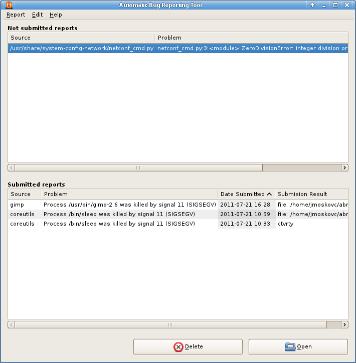
= Main table of reports =
== Columns and sizing ==
There are 3 columns: Reported, Problem, and Last Occurrence. This third
column implies that each report (which is what I assume a row is) can
occur multiple times. It is not clear however how this impacts the report
submission status. How is the user needing this info and for what task?
Perhaps the number of occurrences is more important, as that feels more
important to me.
Recommendation: If there is no value in exposing the “Last Occurrence”
data in this table, remove the column. The Problem column can use the
extra space it seems. If there is some value in exposing this info, need
to clarify what that is in terms of tasks performed. Also consider
exposing number of occurrences if that is available and useful to the
user.
- the "Last Occurence" row is there only to allow us to sort the crashes
according to it, so the newest crash is always the first one
- the plan is to implement a dynamic rows, so user can select, which rows
to show according to his preference
Recommendation: Capitalize “Occurrence” in column title for “Last
Occurrence” if it remains visible
- ok
The Reported column relies on a coloured dot to indicate status it seems.
I was unable, even when searching through the help material, to find a
legend for what those icons mean. There is a concern that relying solely
on colour to convey information results in poor usability (red/green
colour-blindness, cultural meaning of colours, etc). It is also not clear
if the reported and unreported reports should be collected in the same
table. The tasks involved (managing unsubmitted and managing submitted)
seem to be independent of one another for the most part.
Recommendation: Consider separating these two report types out, removing
the need to use the column at all. If the single table is still desired
then it is suggested that something more descriptive be provided than a
coloured dot. For example a tooltip could be used when hovering over the
dot to help explain the meaning of the dot and the crash report's status.
Or consider simply using text instead of an icon, or perhaps a more
obvious icon (checkmark for example – be wary of using crosses for
unsubmitted as that could be confused with deleting the report). See
mockup below for example.
- this sounds reasonable, but it's a bigger change, so I need to discuss
it first with others
--
Ticket URL: <https://fedorahosted.org/design-team/ticket/180#comment:13>
Design Team <http://fedoraproject.org/wiki/Design>
Fedora Design Team
6:46 a.m.
#180: ABRT2 gui review
---------------------------------+------------------------------------------
Reporter: jmoskovc | Owner: kirkb
Type: usability assessment | Status: assigned
Priority: major | Component: Interaction Design / Usability
Severity: Moderately Involved | Resolution:
Keywords: |
---------------------------------+------------------------------------------
Comment (by vda):
I agree with "coloured dot isn't good enough" argument. We can put there
"Yes/No" or a more complex string with all reporting targets we sent this
problem report to: "Bugzilla, RHTSupport"
"Last occurrence" can be formatted more succinctly if we use ISO date
format. Compare:
Thu Jun 23 2001 13:44:28 CEST <=== what abrt uses now
2011-06-23 13:44 <=== same date/time
It's almost twice as short.
--
Ticket URL: <https://fedorahosted.org/design-team/ticket/180#comment:14>
Design Team <http://fedoraproject.org/wiki/Design>
Fedora Design Team
6:46 a.m.
#180: ABRT2 gui review
---------------------------------+------------------------------------------
Reporter: jmoskovc | Owner: kirkb
Type: usability assessment | Status: assigned
Priority: major | Component: Interaction Design / Usability
Severity: Moderately Involved | Resolution:
Keywords: |
---------------------------------+------------------------------------------
Comment (by vda):
Thu Jun 23 2001 13:44:28 CEST <=== what abrt uses now
2011-06-23 13:44 <=== same date/time
(stupid trac)
--
Ticket URL: <https://fedorahosted.org/design-team/ticket/180#comment:15>
Design Team <http://fedoraproject.org/wiki/Design>
Fedora Design Team
10:41 a.m.
#180: ABRT2 gui review
---------------------------------+------------------------------------------
Reporter: jmoskovc | Owner: kirkb
Type: usability assessment | Status: assigned
Priority: major | Component: Interaction Design / Usability
Severity: Moderately Involved | Resolution:
Keywords: |
---------------------------------+------------------------------------------
Comment (by vda):
Menu items are renamed in git.
--
Ticket URL: <https://fedorahosted.org/design-team/ticket/180#comment:16>
Design Team <http://fedoraproject.org/wiki/Design>
Fedora Design Team
6:57 a.m.
#180: ABRT2 gui review
---------------------------------+------------------------------------------
Reporter: jmoskovc | Owner: kirkb
Type: usability assessment | Status: assigned
Priority: major | Component: Interaction Design / Usability
Severity: Moderately Involved | Resolution:
Keywords: |
---------------------------------+------------------------------------------
Comment (by jmoskovc):
What do you imagine the "Details" button should do?
--
Ticket URL: <https://fedorahosted.org/design-team/ticket/180#comment:17>
Design Team <http://fedoraproject.org/wiki/Design>
Fedora Design Team
9:59 a.m.
#180: ABRT2 gui review
---------------------------------+------------------------------------------
Reporter: jmoskovc | Owner: kirkb
Type: usability assessment | Status: assigned
Priority: major | Component: Interaction Design / Usability
Severity: Moderately Involved | Resolution:
Keywords: |
---------------------------------+------------------------------------------
Comment (by kirkb):
Good catch - I hadn't included my thoughts on that in the uploaded version
of the doc. The answer kind of depends on if some of the other changes
are going to be implemented. Specifically if the link to a historical
report is available as per the mockup.
I will upload an updated document with my thoughts, which will also
include partial analysis of the submission process (still a work in
progress). I'm very open to iterating the suggested design if you and the
team see challenges or better ways to do things.
--
Ticket URL: <https://fedorahosted.org/design-team/ticket/180#comment:18>
Design Team <http://fedoraproject.org/wiki/Design>
Fedora Design Team
11:28 a.m.
#180: ABRT2 gui review
---------------------------------+------------------------------------------
Reporter: jmoskovc | Owner: kirkb
Type: usability assessment | Status: assigned
Priority: major | Component: Interaction Design / Usability
Severity: Moderately Involved | Resolution:
Keywords: |
---------------------------------+------------------------------------------
Comment (by kirkb):
The report is now too large for trac's attachment system. I'm putting the
draft up on my fedorapeople webspace: http://kirkb.fedorapeople.org/ABRT/
--
Ticket URL: <https://fedorahosted.org/design-team/ticket/180#comment:19>
Design Team <http://fedoraproject.org/wiki/Design>
Fedora Design Team
9:50 a.m.
#180: ABRT2 gui review
---------------------------------+------------------------------------------
Reporter: jmoskovc | Owner: kirkb
Type: usability assessment | Status: assigned
Priority: major | Component: Interaction Design / Usability
Severity: Moderately Involved | Resolution:
Keywords: |
---------------------------------+------------------------------------------
Comment (by jmoskovc):
implemented the "2 pane UI" probably will need some final tuning, but
it's
a first step:
http://jmoskovc.fedorapeople.org/abrt_main_ui.png
btw - the submission result might contain more than one entry - e.g.
bugzilla link and path to a local file, any ideas how to display this? I
was thinking about a pop-up menu which would show a clickable links where
the submission result is url...
--
Ticket URL: <https://fedorahosted.org/design-team/ticket/180#comment:20>
Design Team <http://fedoraproject.org/wiki/Design>
Fedora Design Team
10:37 p.m.
#180: ABRT2 gui review
---------------------------------+------------------------------------------
Reporter: jmoskovc | Owner: kirkb
Type: usability assessment | Status: assigned
Priority: major | Component: Interaction Design / Usability
Severity: Moderately Involved | Resolution:
Keywords: |
---------------------------------+------------------------------------------
Comment (by kirkb):
Hey - nice work! Great point about the multiple entries. Not sure how
often this would be the case. Assuming it is not the case we want to
optimize for I've mocked up what I think you're proposing, with a few
extra thoughts on your screenshot.
1 - If there are more than 1 result, have a link that reads "View all
results" or "Show all results" that when clicked opens up a popup menu
where the user can choose to view a specific result.
2 - If an element on the screen requires a lot of space but doesn't offer
a lot of value for scanning (like file paths) then I suggest you put that
info in a tooltip (yellow squares in my mockup). We want to emphasize for
the user certain aspects of the report, and the file path may not be the
most important thing to see for scanning (my eyes tend to ignore paths on
first scan). So leave the important stuff visible (filename) and give
them access to the less important stuff (the user can see the complete
path in the details I imagine, but give them a tooltip so they don't have
to go elsewhere to find that info.
3 - The link in the results should always offer the user the ability to
see more details. If a URL, open the link. If a local file, could we
open the file? Is that what the user wants to do with these local files?
If not, what would they want to do with them?
--
Ticket URL: <https://fedorahosted.org/design-team/ticket/180#comment:21>
Design Team <http://fedoraproject.org/wiki/Design>
Fedora Design Team
10:40 p.m.
#180: ABRT2 gui review
---------------------------------+------------------------------------------
Reporter: jmoskovc | Owner: kirkb
Type: usability assessment | Status: assigned
Priority: major | Component: Interaction Design / Usability
Severity: Moderately Involved | Resolution:
Keywords: |
---------------------------------+------------------------------------------
Comment (by kirkb):
Replying to [comment:21 kirkb]:
Here's the mockup
[http://kirkb.fedorapeople.org/ABRT/ABRT%20-%20Main%20Screen%20Mockup%20-%...]
--
Ticket URL: <https://fedorahosted.org/design-team/ticket/180#comment:22>
Design Team <http://fedoraproject.org/wiki/Design>
Fedora Design Team
Hey - nice work! Great point about the multiple entries. Not sure
how
often this would be the case. Assuming it is not the case we want to
optimize for I've mocked up what I think you're proposing, with a few
extra thoughts on your screenshot.
12:38 a.m.
#180: ABRT2 gui review
---------------------------------+------------------------------------------
Reporter: jmoskovc | Owner: kirkb
Type: usability assessment | Status: assigned
Priority: major | Component: Interaction Design / Usability
Severity: Moderately Involved | Resolution:
Keywords: |
---------------------------------+------------------------------------------
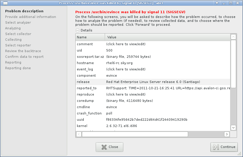
Comment (by kirkb):
Just working through the submission screens and I see that the latest
version of ABRT in Fedora now has the analysis and submission steps as
different.
Could you help me understand a few things?
1 - Does the user pick one and only one analyzer for each crash? Once
they've picked one it looks like they can't pick another? Is this true
even if the analysis fails (i.e. retrace server is busy)?
2 - Why would a user pick one analyzer over another? Do they perform
different types of analysis?
3 - Why should the user do the analysis? What value does it provide to
the user? To the bug report reader?
4 - Is there a good default set of analyzers to include in Fedora? Could
we default to one, then try another, then another if things fail? This
presumes that they all do the same type of analysis.
Thanks for your help in understanding this! You can see my latest screens
(SVGs for now) here: http://kirkb.fedorapeople.org/ABRT/
--
Ticket URL: <https://fedorahosted.org/design-team/ticket/180#comment:23>
Design Team <http://fedoraproject.org/wiki/Design>
Fedora Design Team
12:41 a.m.
#180: ABRT2 gui review
---------------------------------+------------------------------------------
Reporter: jmoskovc | Owner: kirkb
Type: usability assessment | Status: assigned
Priority: major | Component: Interaction Design / Usability
Severity: Moderately Involved | Resolution:
Keywords: |
---------------------------------+------------------------------------------
Comment (by kirkb):
Replying to [comment:23 kirkb]:
Thanks for your help in understanding this! You can see my latest
screens (SVGs for now) here: http://kirkb.fedorapeople.org/ABRT/
By the way, screen 3 is still early. It has submission examples but is
the analysis screen. Ignore that, as I'll update with proper analysis
items once I better understand the use of the screen.
--
Ticket URL: <https://fedorahosted.org/design-team/ticket/180#comment:24>
Design Team <http://fedoraproject.org/wiki/Design>
Fedora Design Team
1:26 a.m.
#180: ABRT2 gui review
---------------------------------+------------------------------------------
Reporter: jmoskovc | Owner: kirkb
Type: usability assessment | Status: assigned
Priority: major | Component: Interaction Design / Usability
Severity: Moderately Involved | Resolution:
Keywords: |
---------------------------------+------------------------------------------
Comment (by jmoskovc):
Just making sure this review won't die - we've been busy fixing the core
problems in F16 and RHEL. We will pay much more attention to gui review in
F17 devel phase.
--
Ticket URL: <https://fedorahosted.org/design-team/ticket/180#comment:25>
Design Team <http://fedoraproject.org/wiki/Design>
Fedora Design Team
3:05 p.m.
#180: ABRT2 gui review
---------------------------------+------------------------------------------
Reporter: jmoskovc | Owner: kirkb
Type: usability assessment | Status: assigned
Priority: major | Component: Interaction Design / Usability
Severity: Moderately Involved | Resolution:
Keywords: |
---------------------------------+------------------------------------------
Comment (by kirkb):
Two issues came up today in discussions that should be included in the GUI
design:
1 - https://fedorahosted.org/abrt/ticket/345 - the idea that if a
duplicate already exists prompt the user how they want to handle it.
Don't just assume they want to add a "me-too" comment to an existing bug
and get subscribed.
2 - there is a request to allow an easier access to root crashes, which
means we need to add some button or checkbox "Show all crashes" which
calls policykit, ask for password and then show all the bugs. This should
go in the main GUI. (jmoskovc in IRC)
--
Ticket URL: <https://fedorahosted.org/design-team/ticket/180#comment:26>
Design Team <http://fedoraproject.org/wiki/Design>
Fedora Design Team
4:24 a.m.
#180: ABRT2 gui review
---------------------------------+------------------------------------------
Reporter: jmoskovc | Owner: kirkb
Type: usability assessment | Status: assigned
Priority: major | Component: Interaction Design / Usability
Severity: Moderately Involved | Resolution:
Keywords: |
---------------------------------+------------------------------------------
Comment (by jmoskovc):
So finally have time to start working on the gui revamp - my first
attempts lead to converting it to gtk3 and the default wizard widget looks
much better there. Kirk, do you think we could stick to the default
widgets? Some of your ideas for the wizard (even though they are nice) are
pretty wild and would require quite a lot of coding. You can check the
gtk3 wizard here: http://jmoskovc.fedorapeople.org/wizard_gtk3.png
--
Ticket URL: <https://fedorahosted.org/design-team/ticket/180#comment:27>
Design Team <http://fedoraproject.org/wiki/Design>
Fedora Design Team
9:26 a.m.
#180: ABRT2 gui review
--------------------------------------+-------------------------------------
Reporter: jmoskovc | Owner: kirkb
Type: usability assessment | Status: assigned
Priority: major | Component: Interaction Design / Usability
Severity: Long-Term / Complex Issue | Resolution:
Keywords: |
--------------------------------------+-------------------------------------
Changes (by kirkb):
* severity: Moderately Involved => Long-Term / Complex Issue
Comment:
That's actually not too bad. It is lacking any kind of obvious indication
that it is a wizard (like numbering the steps - without that it just seems
like a configuration page). But in terms of getting this done for F17 I
say we go with this, tweak it if we can.
I can begin using that layout for mockups. I'd like to put together a few
pages using that layout and start pushing this forward again.
--
Ticket URL: <https://fedorahosted.org/design-team/ticket/180#comment:28>
Design Team <http://fedoraproject.org/wiki/Design>
Fedora Design Team
9:29 a.m.
#180: ABRT2 gui review
--------------------------------------+-------------------------------------
Reporter: jmoskovc | Owner: kirkb
Type: usability assessment | Status: assigned
Priority: major | Component: Interaction Design / Usability
Severity: Long-Term / Complex Issue | Resolution:
Keywords: |
--------------------------------------+-------------------------------------
Comment (by kirkb):
It would be helpful if you could indicate which parts of the wizard are
tweakable/modifiable. I'm assuming:
1 - Step names
2 - Everything in the right panel
What about things like button names, location of buttons, etc? Can other
widgets be placed on the left panel below the steps? Just thinks like
that to help me avoid creating too much work.
--
Ticket URL: <https://fedorahosted.org/design-team/ticket/180#comment:29>
Design Team <http://fedoraproject.org/wiki/Design>
Fedora Design Team
2:39 a.m.
#180: ABRT2 gui review
--------------------------------------+-------------------------------------
Reporter: jmoskovc | Owner: kirkb
Type: usability assessment | Status: assigned
Priority: major | Component: Interaction Design / Usability
Severity: Long-Term / Complex Issue | Resolution:
Keywords: |
--------------------------------------+-------------------------------------
Comment (by jmoskovc):
Similar tools from different OSs at one place:
https://live.gnome.org/GnomeOS/Design/Whiteboards/ProblemReporting
--
Ticket URL: <https://fedorahosted.org/design-team/ticket/180#comment:30>
Design Team <http://fedoraproject.org/wiki/Design>
Fedora Design Team
5:43 p.m.
#180: ABRT2 gui review
-------------------------------------+-------------------------------------
Reporter: jmoskovc | Owner: kirkb
Type: usability assessment | Status: closed
Priority: major | Component: Interaction Design /
Severity: Long-Term / Complex | Usability
Issue | Resolution: wontfix
Keywords: | Blocked By:
Blocking: |
-------------------------------------+-------------------------------------
Changes (by kirkb):
* resolution: => wontfix
* status: assigned => closed
Comment:
I have not been involved in this ticket for years now. Last time I heard
from the team they were going to begin working with Jakob S as a designer
from Red hat. So I am going to close this ticket as wontfix.
All sources of my mocks and a more complete draft of my report are
archived in my fedora people space: https://kirkb.fedorapeople.org/ABRT/
--
Ticket URL: <https://fedorahosted.org/design-team/ticket/180#comment:31>
Design Team <http://fedoraproject.org/wiki/Design>
Fedora Design Team
3479
days inactive
4744
days old
design-team-tickets@lists.fedoraproject.org
31 comments
1 participants
participants (1)
-
 fedora-badges