
9:18 a.m.
Hi folks!
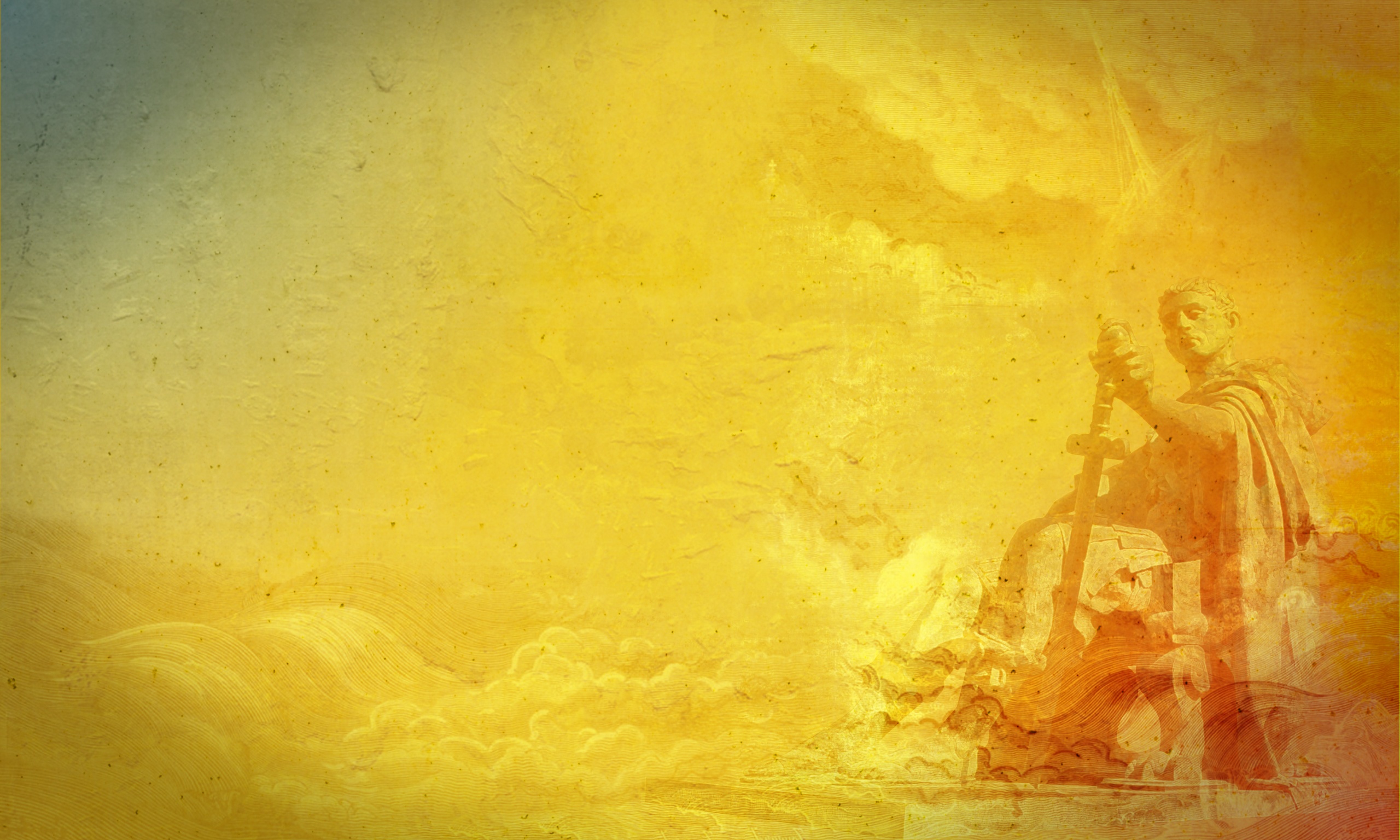
I made another proposal [1] to follow the line of wallpaper Samuele
and changing the tone of color. The concept is simply a composition of
images of the statue of Constantine I [2] in York, England, a texture
of concrete and pieces of lithographs for Gustave Doré (of whom I
admire a lot), the concept is more than obvious that the image of
Constantine is explicit .
[1] http://jaymeayres.fedorapeople.org/f12/fedora-wall-jayme-IV.jpg
[2] http://en.wikipedia.org/wiki/File:2009-04-13_ConstantineTheGreat_York.jpg
Samuele, great draws man!
Cheers
2009/7/28 Samuele Storari <sstorari(a)byte-code.com>:
Hi Guys
This is another idea I'm workin' on.
4 Horses of 4 F Theme
I think about horses 'cause in roman time they were so diffused and not only
a transport, but as a sign of power for the nobilities.
Like a lot of leader statues riding an horse in many squares.
http://www.flickr.com/photos/sstorari/3765877908/
http://www.flickr.com/photos/sstorari/3765878880/
These are only sketches to show my idea and have some feedback, take a look
Ciao
Samuele
----- "Cata" <catalinfest(a)gmail.com> wrote:
> About feedback on my wallpaper :
> Sorry but problems with dense patent and contrast is not very easy to
> remediate.
> Because i use gimp and filter mosaic have minimal 5 px.
> If i use 7 px and more this will be ta range of chars so the text icons il
> be damage .
>
> The result is this (1600x1200 px) :
> http://catalinfest.xhost.ro/imgin/screen4.png
> Maybe is to bluejeans :) but is a ergonomic wallpaper.
>
>
> 2009/7/27 Paul W. Frields <stickster(a)gmail.com>
>
>
> > On Mon, Jul 27, 2009 at 05:49:46PM +0300, Cata wrote:
> > > "...we have one more week for some polishing (*not* final, release
> > > quality
> > > work) and packaging."
> > >
> > > This is correct !
> > >
> > > I try use some wallpapers with icons and the result is not very
> > > impressive.
> > > I show my wallpaper screenshot (the others maybe try some feedback
> > > ...) :
> > >
> > > http://catalinfest.xhost.ro/imgin/screen1.png
> > > http://catalinfest.xhost.ro/imgin/screen2.png
> > > http://catalinfest.xhost.ro/imgin/screen3.png
> >
> >
> FWIW, desktop icons seem to have a somewhat difficult time standing
> > out on any of these backgrounds, and the desktop icon labels even more
> > so. The darkness of the screen1 version makes this problem less
> > severe. The screen2 version, with a less dense pattern, might work
> > better if it was made darker. Same with screen3, only you might want
> > to lower the contrast as well.
> >
> >
> > --
> > Paul W. Frields http://paul.frields.org/
> > gpg fingerprint: 3DA6 A0AC 6D58 FEC4 0233 5906 ACDB C937 BD11 3717
> > http://redhat.com/ - - - - http://pfrields.fedorapeople.org/
> > irc.freenode.net: stickster @ #fedora-docs, #fedora-devel, #fredlug
> > _______________________________________________
> > design-team mailing list
> > design-team(a)lists.fedoraproject.org
> > https://admin.fedoraproject.org/mailman/listinfo/design-team
> >
>
> --
> My sites:
> http://free-tutorials.org - tutorials
> http://tv.free-tutorials.org - video tutorials
> http://catalinfest.xhost.ro - stuff
> http://python-catalin.blogspot.com - my python blog
> http://pygame-catalin.blogspot.com - my pygame blog
>
> _______________________________________________ design-team mailing list
> design-team(a)lists.fedoraproject.org
> https://admin.fedoraproject.org/mailman/listinfo/design-team
--
Samuele Storari
Art Director
Byte-Code srl
mobile: +39 347 50 798 32
office: +39 02 9840047
http://www.byte-code.com
_______________________________________________
design-team mailing list
design-team(a)lists.fedoraproject.org
https://admin.fedoraproject.org/mailman/listinfo/design-team
--
Jayme Ayres
www.jaymeayres.com
www.projetofedora.org
www.twitter.com/jaymeayres
http://fedoraproject.org/wiki/JaymeAyres