tooltip changes
by Matthias Clasen
Just so nobody can say they have been surprised:
I am working on a refresh of the tooltips in our default theme.
Among the things that I am trying out are rounded corners and different
color than the old-school yellow that we've been using ever since. The
leading candidates for a replacement are a light gray or a light blue.
I hope to have packages for this by tomorrow.
Matthias
14 years, 6 months
Polish for F-12 - we have a hard stop date
by Bill Nottingham
We have, on the current schedule:
32. Update and freeze the screenshots page Wed 2009-10-28 Wed 2009-11-04 7
33. Update Fedora tour page Wed 2009-10-28 Wed 2009-11-04 7
Ergo, can we make sure any and all polishing that might affect the
screenshots be finished, packaged, and set up with tag requests on
next Tuesday? That way the marketing team will be able to start their
work on time on Wednesday from rawhide.
Thanks,
Bill
14 years, 6 months

Some recent changes
by Matthias Clasen
Since some folks have wondered, here is a list of some recent changes we
have done to the panel configuration in the desktop spin:
- Gnote has been moved to the left, with the other launchers, the user
switcher has been moved to the far right and the show desktop button has
been removed.
- We have added padding between objects on the panel. If you don't like
this for some reason, you can remove it by
gconftool-2 --type int --set /apps/panel/toplevels/top_panel/padding 0
gconftool-2 --type int --set /apps/panel/toplevels/bottom_panel/padding 0
- We have added padding between status icons in the notification area.
If you like your icons close to each other, use
gconftool-2 --type int --set /apps/panel/applets/systray/prefs/padding 0
- 'Standard' status icons are now put in a fixed order on the right,
while other icons are placed to the left. This means that your volume
control, network, battery, bluetooth indicators will no longer jump
around as icons come and go.
- The clock applet now has a default location, since this feature is
much easier to grasp if there is an initial location.
Matthias
14 years, 6 months

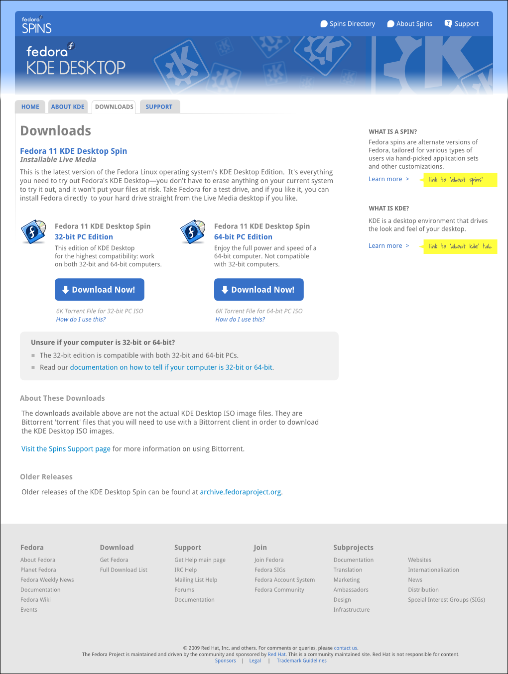
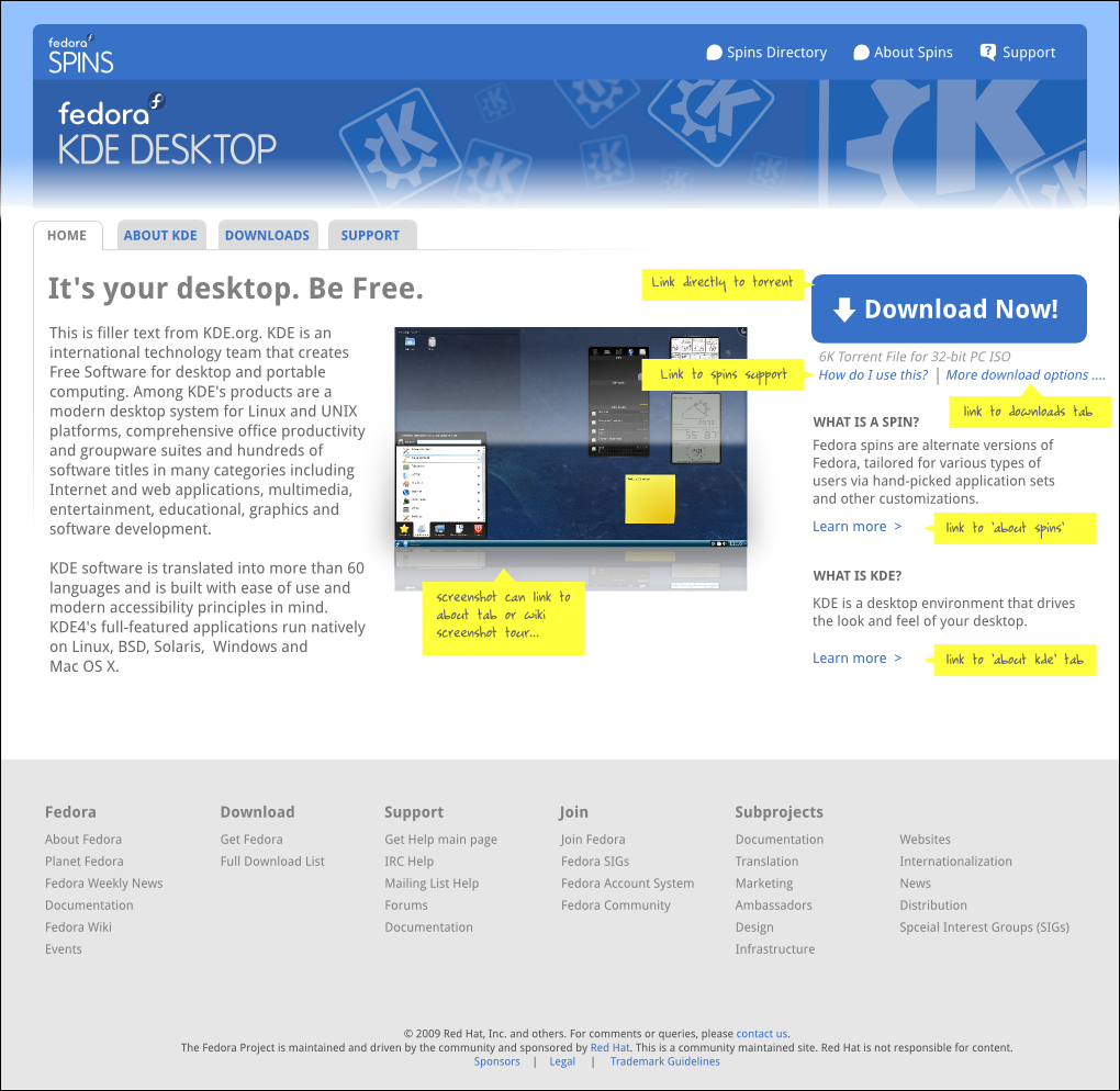
desktop spin page content?
by Máirín Duffy
Hi folks,
So as part of the ongoing Fedora web redesign, we made a design for a
full revamp of spins.fedoraproject.org to have a spins directory with
details pages for each spin.
Here's the mockups for that site:
https://fedoraproject.org/wiki/Website_redesign_2009/Mockups/Spins.fpo
I was wondering if the desktop spin should get a page on there as well?
I put it in the directory mockups. But it is the default spin, so maybe
it doesn't need a spins page? I'm not really sure what's the right call.
What do you think? The timeline on this is really tight (sorry for that)
so I was hoping to get an idea of what to do by next Monday if at all
possible.
If you *do* think it should get its own page on there, can someone help
me come up with content for it? Here's a listing of the content I need
(by next Tuesday? is that do-able?) that I received from the spins SIG
for the other spins:
- A slogan for your spin to serve as the heading for the home page. The
sample one I came up for KDE is: "It's your desktop. Be free." If you
need helping coming up with one I'm happy to help.
- At least a paragraph describing what your spin is used for, who your
spin is for, what unique features it has - that kind of information.
This will also go on the home tab.
- A representative screenshot for your spin.
- For the downloads tab, if you'd like custom text to describe the spin
download, let me know. Otherwise I'll use the defaults in this mockup:
https://fedoraproject.org/w/uploads/c/ce/Spin-details-download.png
- For the support tab, I'd like to know what IRC channels or other live
support options users have for your spin (if any), what mailing lists /
forums / non-live support options users have for your spin (if any), and
what documentation would you like to highlight to new users. An example
is shown here: https://fedoraproject.org/wiki/File:Spin-details-support.png
- Finally, I'd like to create some custom branding for each spin, so the
different spins pages are distinguishable from one another. You can see
in this KDE spin mockup, I did a bar above the tabs that has the KDE
logo. Let me know what kind of graphic you'd like for your spin ASAP and
I can come up with mockups:
https://fedoraproject.org/w/uploads/3/31/Spin-details-home.png
The mockups for the Fedora Electronic Lab spins page are really
fleshed-out and are probably a good example of how the above information
is going to be used:
https://fedoraproject.org/wiki/Website_redesign_2009/Mockups/Spins.fpo#Fe...
I'm *really* sorry I didn't think to send you something sooner. I mailed
the spins SIG list a couple weeks ago and made a few blog posts to
Fedora planet, but I didn't even think about the special case of the
desktop spin.
~m
14 years, 6 months
Interested in helping improve the Fedora desktop experience?
by Máirín Duffy
Hiiii,
So Jon said this:
"Grab one of us on IRC, IM, phone, train, email etc and make a case for
what you want to see. Understand that this will be somewhat easier
once you've built up a reputation for being full of awesome. But
mostly we need people with skill, vision, sanity, and positive energy
helping us make Fedora all that we know it can and will be.
Seriously, bring it. You have great ideas? Want to help form the
vision of the future of computing? Show up, build trust, be awesome."
With this invitation I am wondering if anyone is interested in getting
involved, together with me. I have an idea (I talked to Jon about it
last week I think) for a project to help improve the Fedora experience
for our desktop users and I wanted to see if anyone is interested in
helping out:
= Improve our install experience =
Jon showed me last week how terrible our live media install experience
is. We definitely need to identify all the issues and work through ways
of improving it.
The installer itself, regardless of the live media installer, does need
some serious help, as does the firstboot application. The anaconda team
has put a lot of efforts in F11 and F12 towards a storage system
rewrite, and if you follow Planet Fedora you've likely seen some of my
mockups and discussion around the storage UI design improvements (I
think they won't hit F12 but should make F13):
http://mairin.wordpress.com/2009/08/12/anaconda-advanced-storage-devices/ But
there's screens and scenarios those mockups don't cover - *plenty* of
room for improvement.
I spoke with Chris Lumens and Peter Jones on the anaconda team, and if
in the F13 time frame we can get some nice designs and usability
suggestions lined up, they said they would be happy to work with us to
get those improvements into F14. On top of this, such a project is a
good opportunity for folks to get involved in improving Fedora's overall
desktop experience - no matter what desktop environment camp you're in,
since anaconda and firstboot are a bit agnostic there. :)
Think you might be interested in helping out? Here's some suggestions on
how you could get involved:
- mmcgrath put together some videos of the install process on both f11
and ubuntu this week for another purpose, but he made them available in
case we wanted to do a comparative study. I could definitely use some
help going through these videos, taking notes on them, doing a
comparative analysis (sounds a lot scarier and harder than it actually
is, trust me), and brainstorming some solution to the issues we
identify. The videos are here:
http://mmcgrath.fedorapeople.org/compare/
- We now have a usability lab, and it would be cool to put anaconda and
firstboot through some tests using it. :) Even though the usability lab
equipment is here in my office and you're not, there's a ton of work
that goes into usability testing that doesn't involve the equipment -
especially the up-front prep work. One of the most important work items
for this is putting together a task script for the usability tests.
Here's the script we're using for the Fedora Community tests as an example:
https://fedoraproject.org/wiki/FedoraCommunity/UsabilityTestingRound1/Tes...
You can even run through the testing script on your own without the
fancy-pants equipment. Grab your friends or your family and help
contribute to the data pool!
Of course once we've got some data I'll need some help going through
them and doing the analysis work. Here's an example of this
work-in-progress for the Fedora Community usability tests:
https://fedoraproject.org/wiki/FedoraCommunity/UsabilityTestingRound1/Ana...
If you are interested in either of these work items, reply here or drop
me and email and we can set up a time to chat. You don't have to be a
developer or a designer to do this work, and it would help make a big
positive impact in our user experience. If you work with me to identify
the problems and brainstorm some solutions, I promise you some of my
design time to create mockups so we can then make a case to the
developers to make those improvements happen.
Please please please give it a try :)
~m
14 years, 6 months

UI Discussion
by Owen Taylor
A lot of small changes really don't make sense discussed *in isolation*,
whether it be:
- Padding on the panel
- Icons on menus or not
- Show desktop button there by default
There's going to be pros and cons, its going to look better to some
people, and worse to others, but important pros and cons are going to
have already occurred to the people making the change. There's no point
in having an email thread where people comment on whether it looks
better or worse to them, what features they personally use, etc. The
chance of any new information coming out of such a discussion is
basically zero.
What kind of discussions and suggestions do make sense here?
- How does the Fedora desktop work for your family? Where do they
have trouble? What Fedora features do they love and miss when
they user Windows at work?
- How does the Fedora desktop work you? That's legitimate, just
remember, you are not even a typical Fedora user, much less a
typical computer user. So, discussion from this perspective
is best if you can suggest ways that make Fedora better for
you *and everyone else*.
- What usability nits should we be fixing? Again, remember that
the Fedora and GNOME philosophy is that usability isn't a zero
sum game. Improvements are best when they make things better
for everybody. And then they don't need to be configuration
options.
- How can we make Fedora look better? The best way to make a
case here is often screenshots/mockups that show how changes
fit together. And of course, appearance is personal, so if
it looks obviously better to, it may not look obviously better
to everyone. (or it may!)
- How should the application you are packaging integrate with
the desktop?
- Random technical details related to desktop software;
proposals for new subsystems, etc.
I think it is great that Matthias is posting updates about the polish
changes that he and Jon are making. I think it would be even better
if it was possible to post some screenshots and lists of planned changes
ahead of time. (As always, time is limited, things get done last minute,
hopefully we can move in that direction in the future.)
But *not* so people can sit here and run down the list of planned
changes one by one and debate them. (If you think there is
secret cabal that does that inside Red Hat that sits and does that
in a meeting you are wrong.) So people can propose additional changes,
can show off screenshots where they used 7 pixels of padding instead of
10 and added two on the bottom and it looked way better, and so people
will know where we are going and how their work fits into the picture.
If you want to be part of the Fedora desktop team, don't worry about
whether you are being consulted on every individual decision. Nobody is,
whether they have a @redhat email or not. Worry about what you can be
working on to make the desktop better. If you doing cool things to make
the desktop better and you are being ignored, and you aren't getting
those cool things in, complain! And if you want to help, and have the
time and skills to help, and its not clear what you should be doing to
help, complain about that too.
- Owen
14 years, 6 months
Re: Some recent changes
by Rahul Sundaram
On 10/21/2009 02:39 PM, Behdad Esfahbod wrote:
> On 10/21/2009 05:02 AM, Rahul Sundaram wrote:
> I mean, if you find that function so useful, there's always the
> ctrl+alt+d combination. You can still argue that it's been there for
> ages though.
I am hardly arguing for myself. It would be trivial for me to add back
the panel applet. This discussion is not about my personal preferences
at all but the process of making changes and how it impacts end users.
Rahul
14 years, 6 months
Re: Some recent changes
by Rahul Sundaram
On 10/21/2009 02:33 PM, Behdad Esfahbod wrote:
> On 10/20/2009 09:46 AM, Rahul Sundaram wrote:
>>
>> They don't see the window list in the bottom? The show desktop button
>> has been in the GNOME panel for years and years. I am not sure why you
>> wait for such changes to be done at the last minute. Where does such
>> changes get discussed?
>
> ctr+alt+d?
No idea what you mean by that. You will have to try something less cryptic.
Rahul
14 years, 6 months
Recent changes to gnome-panel
by Adam Williamson
Hi, guys. This is a reply to the 'Some recent changes' thread, but I
wasn't subscribed at that time so can't reply to it directly.
Echoing the concerns raised by Jóhann Guðmundsson, I wanted to pass on
some discussion of these changes from the forums:
http://forums.fedoraforum.org/showthread.php?t=232166
there's concern that this kind of highly-visible behaviour change
shouldn't be introduced this late in the cycle. When I talked to
Matthias on IRC he seemed to think the changes to remove the 'show
desktop' button and reduce the default number of workspaces from 4 to 2
should affect only new users, but the forum discussion seems to indicate
they actually affect existing users too. Is this considered a bug?
(slowjet's problems with icons not showing up and crashing I'll deal
with just as a bug.)
--
Adam Williamson
Fedora QA Community Monkey
IRC: adamw | Fedora Talk: adamwill AT fedoraproject DOT org
http://www.happyassassin.net
14 years, 6 months


