
6:14 a.m.
#353: Required Flyers FudCon 2015 CFP
----------------------------+---------------------------
Reporter: pravins | Owner:
Type: Digital Artwork | Status: new
Priority: high | Severity: Quick & Easy
Keywords: | Blocked By:
Blocking: |
----------------------------+---------------------------
= phenomenon =
We are almost ready to announce CFP.
= reason =
To get reach wider audience and get qualified speaker we need attractive
flyers. We can ask few organizations, college to post on notice boards.
= recommendation =
--
Ticket URL: <https://fedorahosted.org/design-team/ticket/353>
Design Team <http://fedoraproject.org/wiki/Design>
Fedora Design Team
6:47 a.m.
#353: Required Flyers FudCon 2015 CFP
------------------------------+-------------------------
Reporter: pravins | Owner: shatadru
Type: Digital Artwork | Status: new
Priority: high | Severity: Quick & Easy
Resolution: | Keywords:
Blocked By: | Blocking:
------------------------------+-------------------------
Changes (by shatadru):
* owner: => shatadru
--
Ticket URL: <https://fedorahosted.org/design-team/ticket/353#comment:1>
Design Team <http://fedoraproject.org/wiki/Design>
Fedora Design Team
2:50 p.m.
#353: Required Flyers FudCon 2015 CFP
------------------------------+-------------------------
Reporter: pravins | Owner: shatadru
Type: Digital Artwork | Status: new
Priority: high | Severity: Quick & Easy
Resolution: | Keywords: triaged
Blocked By: pravins | Blocking:
------------------------------+-------------------------
Changes (by duffy):
* keywords: => triaged
* blockedby: => pravins
Comment:
Hi Pravin, we can't do any mockups or work on this ticket without content
for the flyers. Can you draft up some text for it? For example:
- Where is the FUDcon? Facility / City / Country
- What are the dates for the FUDcon?
- What kinds of talks are you looking for?
- What is the deadline for talk submissions?
- Where do people submit their talk proposals?
- Is there a theme for the event that we can use to come up with graphical
ideas?
shatadru, are you working with pravins on this off-ticket?
--
Ticket URL: <https://fedorahosted.org/design-team/ticket/353#comment:2>
Design Team <http://fedoraproject.org/wiki/Design>
Fedora Design Team
2:51 p.m.
#353: Required Flyers FudCon 2015 CFP
------------------------------+-------------------------
Reporter: pravins | Owner: shatadru
Type: Digital Artwork | Status: new
Priority: high | Severity: Quick & Easy
Resolution: | Keywords: triaged
Blocked By: pravins | Blocking:
------------------------------+-------------------------
Comment (by duffy):
Another point of information for the designer taking the ticket - you
should work with suchakra to make sure you're using his logo: The ticket
for the logo is: https://fedorahosted.org/design-team/ticket/352
--
Ticket URL: <https://fedorahosted.org/design-team/ticket/353#comment:3>
Design Team <http://fedoraproject.org/wiki/Design>
Fedora Design Team
1:56 a.m.
#353: Required Flyers FudCon 2015 CFP
------------------------------+-------------------------
Reporter: pravins | Owner: shatadru
Type: Digital Artwork | Status: new
Priority: high | Severity: Quick & Easy
Resolution: | Keywords: triaged
Blocked By: pravins | Blocking:
------------------------------+-------------------------
Changes (by siddhesh):
* cc: siddhesh@… (added)
--
Ticket URL: <https://fedorahosted.org/design-team/ticket/353#comment:4>
Design Team <http://fedoraproject.org/wiki/Design>
Fedora Design Team
3:17 a.m.
#353: Required Flyers FudCon 2015 CFP
------------------------------+-------------------------
Reporter: pravins | Owner: shatadru
Type: Digital Artwork | Status: new
Priority: high | Severity: Quick & Easy
Resolution: | Keywords: triaged
Blocked By: pravins | Blocking:
------------------------------+-------------------------
Comment (by pravins):
''' Where is the FUDcon? Facility / City / Country'''
Facility:
MIT College of Engineering, Kothrud
Pune, INDIA
''' What are the dates for the FUDcon?'''
26th to 28 June 2015
''' What kinds of talks are you looking for?'''
Talks, Sessions, Workshops and Hackfests
''' What is the deadline for talk submissions?'''
6th March 2015
''' Where do people submit their talk proposals?'''
http://fudcon.in
''' Is there a theme for the event that we can use to come up with
graphical ideas?'''
'national animal' or 'city monument'
Also, when do you need the flyer design completed by? What is the
deadline?
11th Feb or earlier if possible.
--
Ticket URL: <https://fedorahosted.org/design-team/ticket/353#comment:5>
Design Team <http://fedoraproject.org/wiki/Design>
Fedora Design Team
3:28 a.m.
#353: Required Flyers FudCon 2015 CFP
------------------------------+-------------------------
Reporter: pravins | Owner: shatadru
Type: Digital Artwork | Status: new
Priority: high | Severity: Quick & Easy
Resolution: | Keywords: triaged
Blocked By: pravins | Blocking:
------------------------------+-------------------------
Comment (by siddhesh):
Replying to [comment:5 pravins]:
''' Is there a theme for the event that we can use to
come up with
graphical ideas?'''
'national animal' or 'city monument'
We don't have a theme for the event itself. Suchakra and others may
possibly come up with a theme for the artwork, but that's not decided yet.
--
Ticket URL: <https://fedorahosted.org/design-team/ticket/353#comment:6>
Design Team <http://fedoraproject.org/wiki/Design>
Fedora Design Team
5:58 a.m.
#353: Required Flyers FudCon 2015 CFP
------------------------------+-------------------------
Reporter: pravins | Owner: shatadru
Type: Digital Artwork | Status: new
Priority: high | Severity: Quick & Easy
Resolution: | Keywords: triaged
Blocked By: pravins | Blocking:
------------------------------+-------------------------
Comment (by shatadru):
Replying to [comment:3 duffy]:
Another point of information for the designer taking the ticket - you
should work with suchakra to make sure you're using his logo: The ticket
for the logo is: https://fedorahosted.org/design-team/ticket/352
Hi,
Sorry for the delay.
I will be working with pravins and suchakra and will be using the logo
suchakra submits.
Thank you.[[BR]]
Shatadru
--
Ticket URL: <https://fedorahosted.org/design-team/ticket/353#comment:7>
Design Team <http://fedoraproject.org/wiki/Design>
Fedora Design Team
7:25 a.m.
#353: Required Flyers FudCon 2015 CFP
------------------------------+-------------------------
Reporter: pravins | Owner: shatadru
Type: Digital Artwork | Status: new
Priority: high | Severity: Quick & Easy
Resolution: | Keywords: triaged
Blocked By: pravins | Blocking:
------------------------------+-------------------------
Comment (by shatadru):
Replying to [comment:5 pravins]:
''' Where is the FUDcon? Facility / City /
Country'''
Facility:
MIT College of Engineering, Kothrud
Pune, INDIA
''' What are the dates for the FUDcon?'''
26th to 28 June 2015
''' What kinds of talks are you looking for?'''
Talks, Sessions, Workshops and Hackfests
''' What is the deadline for talk submissions?'''
6th March 2015
''' Where do people submit their talk proposals?'''
http://fudcon.in
''' Is there a theme for the event that we can use to come up with
graphical ideas?'''
'national animal' or 'city monument'
Also, when do you need the flyer design completed by? What is the
deadline?
11th Feb or earlier if possible.
Thank you for providing
the details.[[br]]
-Shatadru
--
Ticket URL: <https://fedorahosted.org/design-team/ticket/353#comment:8>
Design Team <http://fedoraproject.org/wiki/Design>
Fedora Design Team
1:33 p.m.
#353: Required Flyers FudCon 2015 CFP
------------------------------+-------------------------
Reporter: pravins | Owner: shatadru
Type: Digital Artwork | Status: new
Priority: high | Severity: Quick & Easy
Resolution: | Keywords: triaged
Blocked By: pravins | Blocking:
------------------------------+-------------------------
Comment (by shatadru):
The CFP text is not looking good in the flyer, we would need a concise
text for the flyer.
--
Ticket URL: <https://fedorahosted.org/design-team/ticket/353#comment:9>
Design Team <http://fedoraproject.org/wiki/Design>
Fedora Design Team
5:24 a.m.
#353: Required Flyers FudCon 2015 CFP
------------------------------+-------------------------
Reporter: pravins | Owner: shatadru
Type: Digital Artwork | Status: new
Priority: high | Severity: Quick & Easy
Resolution: | Keywords: triaged
Blocked By: pravins | Blocking:
------------------------------+-------------------------
Changes (by pravins):
* cc: pravins@… (added)
--
Ticket URL: <https://fedorahosted.org/design-team/ticket/353#comment:10>
Design Team <http://fedoraproject.org/wiki/Design>
Fedora Design Team
9:44 a.m.
#353: Required Flyers FudCon 2015 CFP
------------------------------+-------------------------
Reporter: pravins | Owner: shatadru
Type: Digital Artwork | Status: new
Priority: high | Severity: Quick & Easy
Resolution: | Keywords: triaged
Blocked By: pravins | Blocking:
------------------------------+-------------------------
Comment (by jurankdankkal):
Hi, this is my
[https://jurankdankkal.fedorapeople.org/FUDCon/FUDConPune2015/final/flyer/
flyers] version.
--
Ticket URL: <https://fedorahosted.org/design-team/ticket/353#comment:11>
Design Team <http://fedoraproject.org/wiki/Design>
Fedora Design Team
11:44 a.m.
#353: Required Flyers FudCon 2015 CFP
------------------------------+-------------------------
Reporter: pravins | Owner: shatadru
Type: Digital Artwork | Status: new
Priority: high | Severity: Quick & Easy
Resolution: | Keywords: triaged
Blocked By: | Blocking:
------------------------------+-------------------------
Changes (by duffy):
* blockedby: pravins =>
--
Ticket URL: <https://fedorahosted.org/design-team/ticket/353#comment:12>
Design Team <http://fedoraproject.org/wiki/Design>
Fedora Design Team
12:43 p.m.
#353: Required Flyers FudCon 2015 CFP
------------------------------+-------------------------
Reporter: pravins | Owner: shatadru
Type: Digital Artwork | Status: new
Priority: high | Severity: Quick & Easy
Resolution: | Keywords: triaged
Blocked By: pravins | Blocking:
------------------------------+-------------------------
Changes (by duffy):
* blockedby: => pravins
Comment:
Pravins, we really need written copy for the flyer here. What you provided
is too long - we need a call to action, and also maybe a list of topics
for people to understand whatt kinds of proposals you're looking for.
--
Ticket URL: <https://fedorahosted.org/design-team/ticket/353#comment:13>
Design Team <http://fedoraproject.org/wiki/Design>
Fedora Design Team
12:43 p.m.
#353: Required Flyers FudCon 2015 CFP
------------------------------+-------------------------
Reporter: pravins | Owner: shatadru
Type: Digital Artwork | Status: new
Priority: high | Severity: Quick & Easy
Resolution: | Keywords: triaged
Blocked By: pravins | Blocking:
------------------------------+-------------------------
Comment (by duffy):
critique/feedback from design team meeting today
{{{
<mizmo> okay so we have this esign by shatadru: https://fedorahosted.org
/design-team/raw-attachment/ticket/353/353_2.png
<mizmo> and he astutely noted that the CFP text is way too dense for the
flyer, and that more concise text is needed
<mizmo> (maybe this is why he left pravins in the blocked by field)
<gnokii> blue on blue
<mizmo> these are the mockups jurank_dankkal came up with:
<mizmo>
https://jurankdankkal.fedorapeople.org/FUDCon/FUDConPune2015/final/flyer/
<mizmo> this is the first one:
<mizmo>
https://jurankdankkal.fedorapeople.org/FUDCon/FUDConPune2015/final/flyer/...
<mizmo> on this one i have a few points of feedback:
<mizmo> - the orange and green are really bright and will probably be out
of gamut for printers
<gnokii> ++
<mizmo> - when you look at a flyer like this, there are a few points of
information that should stand out right away. since it's a CFP
<mizmo> - the deadline, event name, and the types of proposals they are
looking for are the most important htings i think
<gnokii> the green has to be spot color you definitely gets that otherwise
printed
<mizmo> but when i stare at this flyer all i see are bright green and
orange, they take a lot of attention away
<mizmo> i think it's a cool technique to take the fedora triangles and
make them an indian flag but i think it's too loud for this application
<mizmo> i think the ticket requestor needs to provide better copy for the
flyer
<gnokii> just replace that with our green and orange
<mizmo> i would even drop the flag colors
<mizmo> or maybe fade it out, 50% transparency or something
<finalzone> fade out seems a better option
<mizmo> yeh it seems like a lot of visual noise otherwise
<mizmo> this flyer doesn't have a call to action either
<mleonova> is it on purpose that some triangles have spaces in between?
<mizmo> like if you want to get people to submit talks, have a big
headline like, "We need your talks!"
<mizmo> or "Propose your talk today!"
<mizmo> some kind of call to action
<mizmo> okay jurank_dankkal 's second design is here:
<mizmo>
https://jurankdankkal.fedorapeople.org/FUDCon/FUDConPune2015/final/flyer/...
<mizmo> i like this one much better because the focus is more on the
content
<jurank_dankkal> yeah I also feel that way, just trying to do fedora
triangle with indian flag, but it's hard to put the content n combine the
color
<mizmo> i like the design in the backgroudn too - you got the orange and
green in there but it's not as loud. the only thing is it interacts a lot
with the fudcon pune logo, i'd consider separating them (or again, the old
trick of 50% opacity the wheel in the back)
<mizmo> the information is presented great here too, we're just missing a
list of talk topics
<mizmo> which the reporter didn't provide
<mizmo> i think maybe the white outlines on the fudcon logo are too
extreme too
<fedmsg-design> trac.ticket.update -- kevin closed a ticket on the Fedora
Infrastructure trac instance as 'fixed' https://fedorahosted.org/fedora-
infrastructure/ticket/4676
<mizmo> it looks off to me, i'm not sure why though
<ryanlerch> also, if it is for printing out (on a lazer or inkjet), having
a olid color on the BG is not
<ryanlerch> going to look that good
<mizmo> yeh it'll have lines
<ryanlerch> and heavy on the ink for people printing it out
<mizmo> are people going to know what fudcon is? that it's for fedora?
<mizmo> it should maybe point out it's the Fedora conference
<mizmo> here's what i'd suggest -
<finalzone> thin white line for the fudcon logo?
<mizmo> - we'll set the ticket to block on pravins and ask him for solid
copy for the flyer, suggesting that he provide a list of topics for people
to propose talks about
<mizmo> - jurank_dankkal, i would contact shatadru since it's his ticket
and coordinate with him based on the feedback we gave you today - i'd
suggest designing on a white bg too
<gnokii> makes no sense anymore
<mizmo> does that seem like a reasonable plan?
<gnokii> deadline 6th march thats next week
<jurank_dankkal> yeah sure mizmo , thanks for the feedbacks guys..
<mizmo> cool hope it helps!
<jurank_dankkal> i think maybe the white outlines on the fudcon logo are
too extreme too >> do you mean the strokes on the logo?
<mizmo> jurank_dankkal, yeh the strokes on the logo, they don't look
right, i think they need to be thicker
<mizmo> they make some artifacts like a little diamond between the 4
logomark pieces
<jurank_dankkal> okay, so I'll make it more thicker and also ticket 352
need to be changed too..
}}}
--
Ticket URL: <https://fedorahosted.org/design-team/ticket/353#comment:14>
Design Team <http://fedoraproject.org/wiki/Design>
Fedora Design Team
4:03 a.m.
#353: Required Flyers FudCon 2015 CFP
------------------------------+-------------------------
Reporter: pravins | Owner: shatadru
Type: Digital Artwork | Status: new
Priority: high | Severity: Quick & Easy
Resolution: | Keywords: triaged
Blocked By: pravins | Blocking:
------------------------------+-------------------------
Comment (by pravins):
Yes.
I had discussion with shatadru yesterday and referred to him something
like http://www.asefma.es/wp-content/uploads/2014/10/Call-for-Papers-
flyer-723x1024.jpg
I liked
https://jurankdankkal.fedorapeople.org/FUDCon/FUDConPune2015/final/flyer/...
from jurankdankkal. Good if we can further modify with something like
above or if any other better idea.
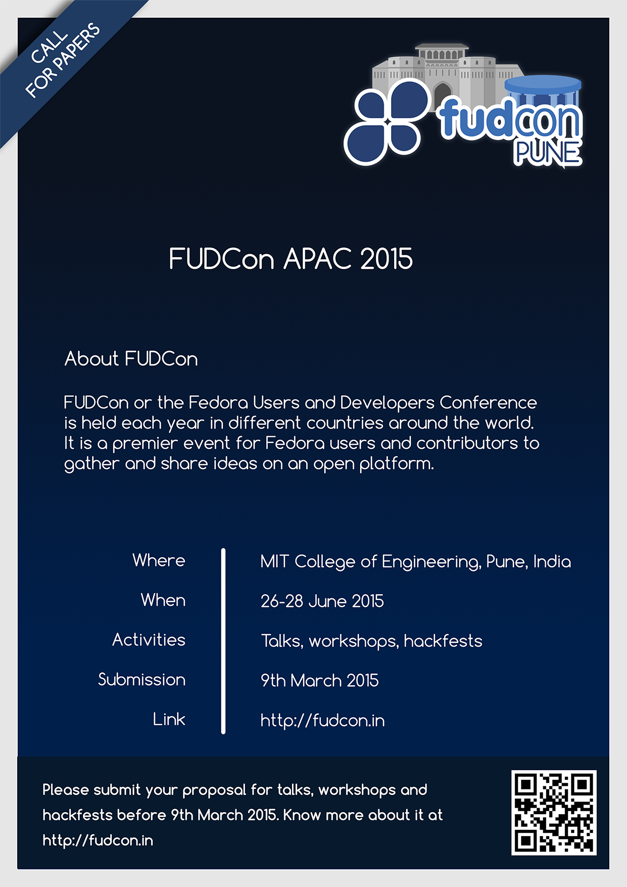
'''I think below contents will be sufficient for CFP FLYERS:'''
FUDCon APAC 2015
26-28 Jun 2015, MIT College of Engineering, Pune, India
www.fudcon.in
Call for Papers is open now !!
FUDCon is an international free software event held each year in different
countries around the world.
Keeping in line with the aim of increasing participation to Fedora and
engaging with various OpenSource communities, we hereby invite you to
submit proposals of interest for '''Talks, Workshops and
Hackfests'''
Submit your papers before 9th March 2015
Should add QR code for http://fudcon.in/call-paper
--
Ticket URL: <https://fedorahosted.org/design-team/ticket/353#comment:15>
Design Team <http://fedoraproject.org/wiki/Design>
Fedora Design Team
10:22 a.m.
#353: Required Flyers FudCon 2015 CFP
------------------------------+-------------------------
Reporter: pravins | Owner: shatadru
Type: Digital Artwork | Status: new
Priority: high | Severity: Quick & Easy
Resolution: | Keywords: triaged
Blocked By: pravins | Blocking:
------------------------------+-------------------------
Comment (by jurankdankkal):
Okay, I'll try to make it like the referred design.
--
Ticket URL: <https://fedorahosted.org/design-team/ticket/353#comment:16>
Design Team <http://fedoraproject.org/wiki/Design>
Fedora Design Team
12:22 p.m.
#353: Required Flyers FudCon 2015 CFP
------------------------------+-------------------------
Reporter: pravins | Owner: shatadru
Type: Digital Artwork | Status: new
Priority: high | Severity: Quick & Easy
Resolution: | Keywords: triaged
Blocked By: pravins | Blocking:
------------------------------+-------------------------
Comment (by siddhesh):
Replying to [comment:15 pravins]:
Call for Papers is open now !!
FUDCon is an international free software event held each year in
different
countries around the world.
Keeping in line with the aim of increasing participation to Fedora and
engaging
with various OpenSource communities, we hereby invite you to
submit proposals of interest for '''Talks, Workshops and
Hackfests'''
Submit your papers before 9th March 2015
Should add QR code for http://fudcon.in/call-paper
This still seems too verbose for a flyer. Please think of a more concise
text, something like:
= FUDCon APAC 2015 =
When | 26-28 June 2015
Where | MIT College of Engineering, Pune, India
== Call for Papers ==
Please submit your proposal for talks, workshops and hackfests before 9th
March 2015. Know more about it at http://fudcon.in
==== About FUDCon ====
FUDCon or the Fedora Users and Developers Conference is held each year in
different countries around the world. It is a premier event for Fedora
users and contributors to gather and share ideas on an open platform.
====
The About FUDCon bit could also be optional. The above is just an example
btw. It would be nice if someone comes up with something more clever.
--
Ticket URL: <https://fedorahosted.org/design-team/ticket/353#comment:17>
Design Team <http://fedoraproject.org/wiki/Design>
Fedora Design Team
1:09 p.m.
#353: Required Flyers FudCon 2015 CFP
------------------------------+-------------------------
Reporter: pravins | Owner: shatadru
Type: Digital Artwork | Status: new
Priority: high | Severity: Quick & Easy
Resolution: | Keywords: triaged
Blocked By: pravins | Blocking:
------------------------------+-------------------------
Comment (by duffy):
What do you guys want the proposals to be about? Fedora specifically? Is
it ok for any open source technology to be discussed? Are UX / docs / etc
things welcome too? Is there a list somewhere of the topics you're
interested in?
--
Ticket URL: <https://fedorahosted.org/design-team/ticket/353#comment:18>
Design Team <http://fedoraproject.org/wiki/Design>
Fedora Design Team
9:04 p.m.
#353: Required Flyers FudCon 2015 CFP
------------------------------+-------------------------
Reporter: pravins | Owner: shatadru
Type: Digital Artwork | Status: new
Priority: high | Severity: Quick & Easy
Resolution: | Keywords: triaged
Blocked By: pravins | Blocking:
------------------------------+-------------------------
Comment (by siddhesh):
Replying to [comment:18 duffy]:
What do you guys want the proposals to be about? Fedora specifically?
Is
it ok for any open source technology to be discussed? Are UX / docs / etc
things welcome too? Is there a list somewhere of the topics you're
interested in?
The primary focus would be Fedora and CentOS, but proposals need not be
limited to them. We have an indicative list in the [http://fudcon.in
/call-paper CFP] but that is not meant to be exhaustive and putting it in
the flyer may turn away interesting talks that don't strictly fit into
that list. UX, docs, design, technology in education/government, etc. are
also equally welcome provided they're about FOSS.
--
Ticket URL: <https://fedorahosted.org/design-team/ticket/353#comment:19>
Design Team <http://fedoraproject.org/wiki/Design>
Fedora Design Team
4:43 p.m.
#353: Required Flyers FudCon 2015 CFP
------------------------------+-------------------------
Reporter: pravins | Owner: shatadru
Type: Digital Artwork | Status: new
Priority: high | Severity: Quick & Easy
Resolution: | Keywords: triaged
Blocked By: pravins | Blocking:
------------------------------+-------------------------
Comment (by shatadru):
Submitting my first draft :
https://shatadru.fedorapeople.org/353-simplified_1.png
--
Ticket URL: <https://fedorahosted.org/design-team/ticket/353#comment:20>
Design Team <http://fedoraproject.org/wiki/Design>
Fedora Design Team
11:50 p.m.
#353: Required Flyers FudCon 2015 CFP
------------------------------+-------------------------
Reporter: pravins | Owner: shatadru
Type: Digital Artwork | Status: new
Priority: high | Severity: Quick & Easy
Resolution: | Keywords: triaged
Blocked By: pravins | Blocking:
------------------------------+-------------------------
Comment (by pravins):
Thank you Shatadru.
I liked it. Its basic but working :)
On the other hand its only 1 week remained for CFP, so doing more
effort on it might be not worth at this moment.
We can put more effort of actual conference flyer.
If no one has objection with
https://shatadru.fedorapeople.org/353-simplified_1.png
Will start spreading this with reminder of CFP.
--
Ticket URL: <https://fedorahosted.org/design-team/ticket/353#comment:21>
Design Team <http://fedoraproject.org/wiki/Design>
Fedora Design Team
6:51 a.m.
#353: Required Flyers FudCon 2015 CFP
------------------------------+-------------------------
Reporter: pravins | Owner: shatadru
Type: Digital Artwork | Status: new
Priority: high | Severity: Quick & Easy
Resolution: | Keywords: triaged
Blocked By: pravins | Blocking:
------------------------------+-------------------------
Comment (by suchakra):
Oh! I did not follow this ticket progress for quite sometime.
We can put more effort of actual conference flyer.
Yes I would do that in the current situation.
If no one has objection with
https://shatadru.fedorapeople.org/353-simplified_1.png
Will start spreading this with reminder of CFP.
The logo is not right however. The stroke length on the text is very less.
I would usually just wrap the whole logo in a big white stroke like I did
for stickers here [1]. This would be the minimum thing to do at the
moment.
[1] https://fedorahosted.org/design-team/attachment/ticket/320/sticker-
sheet.svg
--
Ticket URL: <https://fedorahosted.org/design-team/ticket/353#comment:22>
Design Team <http://fedoraproject.org/wiki/Design>
Fedora Design Team
7:46 a.m.
#353: Required Flyers FudCon 2015 CFP
------------------------------+-------------------------
Reporter: pravins | Owner: shatadru
Type: Digital Artwork | Status: new
Priority: high | Severity: Quick & Easy
Resolution: | Keywords: triaged
Blocked By: pravins | Blocking:
------------------------------+-------------------------
Comment (by suchakra):
I could come up with this [1] quickly. This [2] is how it would look on
dark backgrounds. So maybe you can use this. Not super-awesome, but it
would be better than previous one till we reach a solution I think.
[1] https://fedorahosted.org/design-team/attachment/ticket/353/logo-
dark.png[[BR]]
[2] https://fedorahosted.org/design-team/attachment/ticket/353/logo-dark-
preview.png
--
Ticket URL: <https://fedorahosted.org/design-team/ticket/353#comment:23>
Design Team <http://fedoraproject.org/wiki/Design>
Fedora Design Team
9 a.m.
#353: Required Flyers FudCon 2015 CFP
------------------------------+-------------------------
Reporter: pravins | Owner: shatadru
Type: Digital Artwork | Status: new
Priority: high | Severity: Quick & Easy
Resolution: | Keywords: triaged
Blocked By: pravins | Blocking:
------------------------------+-------------------------
Comment (by shatadru):
Replying to [comment:23 suchakra]:
I could come up with this [1] quickly. This [2] is how it would look
on
dark backgrounds. So maybe you can use this. Not super-awesome, but it
would be better than previous one till we reach a solution I think.
dark.png
[[BR]]
dark-preview.png
Suchakra, sorry my apologies, I will update it with the logo you uploaded.
--
Ticket URL: <https://fedorahosted.org/design-team/ticket/353#comment:24>
Design Team <http://fedoraproject.org/wiki/Design>
Fedora Design Team
12:42 p.m.
#353: Required Flyers FudCon 2015 CFP
------------------------------+-------------------------
Reporter: pravins | Owner: shatadru
Type: Digital Artwork | Status: new
Priority: high | Severity: Quick & Easy
Resolution: | Keywords: triaged
Blocked By: pravins | Blocking:
------------------------------+-------------------------
Comment (by shatadru):
Changed the logo : https://shatadru.fedorapeople.org/353-simplified2.png
--
Ticket URL: <https://fedorahosted.org/design-team/ticket/353#comment:25>
Design Team <http://fedoraproject.org/wiki/Design>
Fedora Design Team
8:01 a.m.
#353: Required Flyers FudCon 2015 CFP
------------------------------+-------------------------
Reporter: pravins | Owner: shatadru
Type: Digital Artwork | Status: new
Priority: high | Severity: Quick & Easy
Resolution: | Keywords: triaged
Blocked By: pravins | Blocking:
------------------------------+-------------------------
Comment (by shatadru):
here is another one :
https://shatadru.fedorapeople.org/fudcon_apac_15/353/353-3-1-compressed.png
--
Ticket URL: <https://fedorahosted.org/design-team/ticket/353#comment:26>
Design Team <http://fedoraproject.org/wiki/Design>
Fedora Design Team
11:15 a.m.
#353: Required Flyers FudCon 2015 CFP
------------------------------+-------------------------
Reporter: pravins | Owner: shatadru
Type: Digital Artwork | Status: closed
Priority: high | Severity: Quick & Easy
Resolution: fixed | Keywords: triaged
Blocked By: pravins | Blocking:
------------------------------+-------------------------
Changes (by duffy):
* resolution: => fixed
* status: new => closed
Comment:
since the CFP is over, I'm closing this ticket.
--
Ticket URL: <https://fedorahosted.org/design-team/ticket/353#comment:27>
Design Team <http://fedoraproject.org/wiki/Design>
Fedora Design Team
11:26 a.m.
#353: Required Flyers FudCon 2015 CFP
------------------------------+-------------------------
Reporter: pravins | Owner: shatadru
Type: Digital Artwork | Status: closed
Priority: high | Severity: Quick & Easy
Resolution: fixed | Keywords: triaged
Blocked By: | Blocking:
------------------------------+-------------------------
Changes (by duffy):
* blockedby: pravins =>
--
Ticket URL: <https://fedorahosted.org/design-team/ticket/353#comment:28>
Design Team <http://fedoraproject.org/wiki/Design>
Fedora Design Team
3338
days inactive
3387
days old
design-team-tickets@lists.fedoraproject.org
28 comments
1 participants
participants (1)
-
 fedora-badges