Re: Noto fonts - ugly and unreadable for everyone or just me?
- First Post
- Replies
- Stats
-
Go to
- ----- 2024 -----
- June
- May
- April
- March
- February
- January
- ----- 2023 -----
- December
- November
- October
- September
- August
- July
- June
- May
- April
- March
- February
- January
- ----- 2022 -----
- December
- November
- October
- September
- August
- July
- June
- May
- April
- March
- February
- January
- ----- 2021 -----
- December
- November
- October
- September
- August
- July
- June
- May
- April
- March
- February
- January
- ----- 2020 -----
- December
- November
- October
- September
- August
- July
- June
- May
- April
- March
- February
- January
- ----- 2019 -----
- December
- November
- October
- September
- August
- July
- June
- May
- April
- March
- February
- January
- ----- 2018 -----
- December
- November
- October
- September
- August
- July
- June
- May
- April
- March
- February
- January
- ----- 2017 -----
- December
- November
- October
- September
- August
- July
- June
- May
- April
- March
- February
- January
- ----- 2016 -----
- December
- November
- October
- September
- August
- July
- June
- May
- April
- March
- February
- January
- ----- 2015 -----
- December
- November
- October
- September
- August
- July
- June
- May
- April
- March
- February
- January
- ----- 2014 -----
- December
- November
- October
- September
- August
- July
- June
- May
- April
- March
- February
- January
- ----- 2013 -----
- December
- November
- October
- September
- August
- July
- June
- May
- April
- March
- February
- January
- ----- 2012 -----
- December
- November
- October
- September
- August
- July
- June
- May
- April
- March
- February
- January
- ----- 2011 -----
- December
- November
- October
- September
- August
- July
- June
- May
- April
- March
- February
- January
- ----- 2010 -----
- December
- November
- October
- September
- August
- July
- June
- May
- April
- March
- February
- January
- ----- 2009 -----
- December
- November
- October
- September
- August
- July
- June
- May
- April
- March
- February
- January
- ----- 2008 -----
- December
- November
- October
- September
- August
- July
- June
- May
- April
- March
- February
- January
- ----- 2007 -----
- December
- November
- October
- September
- August
- July
- June
- May
- April
- March
- February
- January
- ----- 2006 -----
- December
- November
- October
- September
- August
- July
- June
- May
- April
- March
- February
- January
- ----- 2005 -----
- December
- November
- October
- September
- August
- July
- June
- May
- April
- March
- February
- January
- ----- 2004 -----
- December
- November
- October
- September
- August
- July
- June
- May
- April
- March
- February
- January
- ----- 2003 -----
- December
- November
- October
- September
- August
- July
- June
- May
- April
- March
- February
- January
- ----- 2002 -----
- December
- November
- October
- September
- August
- July
- June
- May
- April
- March
- February
- January
- ----- 2001 -----
- December
- November
- October
- September
- August
- July
- June
- May
- April
- March
- February
- January
- ----- 2000 -----
- December
- November
- October
- September
- August
- July
- June
- May
- April
- March
- February
- January
- ----- 1999 -----
- December
- November
- October
- September
- August
- July
- June
- May
- April
- March
- February
- January
- ----- 1998 -----
- December
- November
- October
- September
- August
- July
- June
- May
- April
- March
- February
- January
- ----- 1997 -----
- December
- November
- October
- September
- August
- July
- June
- May
- April
- March
- February
- January
- ----- 1996 -----
- December
- November
- October
- September
- August
- July
- June
- May
- April
- March
- February
- January
- ----- 1995 -----
- December
- November
- October
- September
- August
- July
- June
- May
- April
- March
- February
- January
- ----- 1994 -----
- December
- November
- October
- September
- August
- July
- June
- May
- April
- March
- February
- January
- ----- 1993 -----
- December
- November
- October
- September
- August
- July
- June
- May
- April
- March
- February
- January
- ----- 1992 -----
- December
- November
- October
- September
- August
- July
- June
- May
- April
- March
- February
- January
- ----- 1991 -----
- December
- November
- October
- September
- August
- July
- June
- May
- April
- March
- February
- January
- ----- 1990 -----
- December
- November
- October
- September
- August
- July
- June
- May
- April
- March
- February
- January
- ----- 1989 -----
- December
- November
- October
- September
- August
- July
- June
- May
- April
- March
- February
- January
- ----- 1988 -----
- December
- November
- October
- September
- August
- July
- June
- May
- April
- March
- February
- January
- ----- 1987 -----
- December
- November
- October
- September
- August
- July
- June
- May
- April
- March
- February
- January
- ----- 1986 -----
- December
- November
- October
- September
- August
- July
- June
- May
- April
- March
- February
- January
- ----- 1985 -----
- December
- November
- October
- September
- August
- July
- June
- May
- April
- March
- February
- January
- ----- 1984 -----
- December
- November
- October
- September
- August
- July
- June
- May
- April
- March
- February
- January
- ----- 1983 -----
- December
- November
- October
- September
- August
- July
- June
- May
- April
- March
- February
- January
- ----- 1982 -----
- December
- November
- October
- September
- August
- July
- June
- May
- April
- March
- February
- January
- ----- 1981 -----
- December
- November
- October
- September
- August
- July
- June
- May
- April
- March
- February
- January
- ----- 1980 -----
- December
- November

On Sun, Sep 18, 2022 at 08:29:52PM +0800, Lily White wrote:
Also, please attach a screenshot so we'll know if it's
actually a
problem or a personal taste issue.
http://oirase.annexia.org/tmp/ugly.png
And don't forget to go to the test list.
The same thing would apparently happen on F36.
Rich.
--
Richard Jones, Virtualization Group, Red Hat http://people.redhat.com/~rjones
Read my programming and virtualization blog: http://rwmj.wordpress.com
virt-p2v converts physical machines to virtual machines. Boot with a
live CD or over the network (PXE) and turn machines into KVM guests.
http://libguestfs.org/virt-v2v
Sunday, 18 September
Sun, 18 Sep
11:36 a.m.
New subject: Noto fonts - ugly and unreadable for everyone or just me?
On Sun, Sep 18, 2022 at 05:30:42PM +0100, Richard W.M. Jones wrote:
On Sun, Sep 18, 2022 at 08:29:52PM +0800, Lily White wrote:
> Also, please attach a screenshot so we'll know if it's actually a
> problem or a personal taste issue.
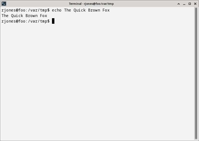
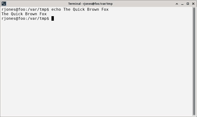
http://oirase.annexia.org/tmp/ugly.png
Terminal after upgrade:
http://oirase.annexia.org/tmp/ugly2.png
This is using DejaVu Mono which is how it looked before:
http://oirase.annexia.org/tmp/normal.png
Rich.
--
Richard Jones, Virtualization Group, Red Hat http://people.redhat.com/~rjones
Read my programming and virtualization blog: http://rwmj.wordpress.com
libguestfs lets you edit virtual machines. Supports shell scripting,
bindings from many languages. http://libguestfs.org
Monday, 19 September
Mon, 19 Sep
9:03 a.m.
New subject: Noto fonts - ugly and unreadable for everyone or just me?
On Sun, Sep 18, 2022 at 05:36:14PM +0100, Richard W.M. Jones wrote:
On Sun, Sep 18, 2022 at 05:30:42PM +0100, Richard W.M. Jones wrote:
> On Sun, Sep 18, 2022 at 08:29:52PM +0800, Lily White wrote:
> > Also, please attach a screenshot so we'll know if it's actually a
> > problem or a personal taste issue.
>
> http://oirase.annexia.org/tmp/ugly.png
Terminal after upgrade:
http://oirase.annexia.org/tmp/ugly2.png
This is using DejaVu Mono which is how it looked before:
http://oirase.annexia.org/tmp/normal.png
I separately upgraded another laptop from F35 to F36 using dnf
system-upgrade, and the font problem was the same, so this isn't a
F37 / testing problem as far as I can tell.
Rich.
--
Richard Jones, Virtualization Group, Red Hat http://people.redhat.com/~rjones
Read my programming and virtualization blog: http://rwmj.wordpress.com
libguestfs lets you edit virtual machines. Supports shell scripting,
bindings from many languages. http://libguestfs.org

On 18 Sep 2022, at 17:36, Richard W.M. Jones
<rjones(a)redhat.com> wrote:
On Sun, Sep 18, 2022 at 05:30:42PM +0100, Richard W.M. Jones wrote:
>> On Sun, Sep 18, 2022 at 08:29:52PM +0800, Lily White wrote:
>> Also, please attach a screenshot so we'll know if it's actually a
>> problem or a personal taste issue.
>
> http://oirase.annexia.org/tmp/ugly.png
Terminal after upgrade:
http://oirase.annexia.org/tmp/ugly2.png
This is using DejaVu Mono which is how it looked before:
http://oirase.annexia.org/tmp/normal.png
I see that the line spacing is bigger with Noto, but both look fine to me from you
images.
What is it that you are finding ugly about noto that is great I deja?
Barry
Rich.
--
Richard Jones, Virtualization Group, Red Hat http://people.redhat.com/~rjones
Read my programming and virtualization blog: http://rwmj.wordpress.com
libguestfs lets you edit virtual machines. Supports shell scripting,
bindings from many languages. http://libguestfs.org
_______________________________________________
users mailing list -- users(a)lists.fedoraproject.org
To unsubscribe send an email to users-leave(a)lists.fedoraproject.org
Fedora Code of Conduct: https://docs.fedoraproject.org/en-US/project/code-of-conduct/
List Guidelines: https://fedoraproject.org/wiki/Mailing_list_guidelines
List Archives:
https://lists.fedoraproject.org/archives/list/users@lists.fedoraproject.org
Do not reply to spam, report it: https://pagure.io/fedora-infrastructure/new_issue
Thursday, 22 September
Thu, 22 Sep
2:58 a.m.
New subject: Noto fonts - ugly and unreadable for everyone or just me?
On Mon, Sep 19, 2022 at 09:58:16PM +0100, Barry wrote:
What is it that you are finding ugly about noto that is great I deja?
Small spidery unreadable letters. They actually appear better somehow
in the screenshots than they do on the screen itself.
Rich.
--
Richard Jones, Virtualization Group, Red Hat http://people.redhat.com/~rjones
Read my programming and virtualization blog: http://rwmj.wordpress.com
virt-builder quickly builds VMs from scratch
http://libguestfs.org/virt-builder.1.html

Barry wrote:
> What is it that you are finding ugly about noto that is great I
deja?
Richard W.M. Jones:
Small spidery unreadable letters. They actually appear better
somehow
in the screenshots than they do on the screen itself.
Are you scaling the screen display?
I saw very little difference between the screen shots, too (minor
differences in sizing and spacing).
--
uname -rsvp
Linux 3.10.0-1160.76.1.el7.x86_64 #1 SMP Wed Aug 10 16:21:17 UTC 2022 x86_64
Boilerplate: All unexpected mail to my mailbox is automatically deleted.
I will only get to see the messages that are posted to the mailing list.

6:31 a.m.
New subject: Noto fonts - ugly and unreadable for everyone or just me?
On Thu, Sep 22, 2022 at 5:18 AM Tim via users <users(a)lists.fedoraproject.org>
wrote:
Barry wrote:
>> What is it that you are finding ugly about noto that is great I deja?
Richard W.M. Jones:
> Small spidery unreadable letters. They actually appear better somehow
> in the screenshots than they do on the screen itself.
>
Are you scaling the screen display?
I saw very little difference between the screen shots, too (minor
differences in sizing and spacing).
Same for me. There are many configuration options for anti-aliasing,
scaling when display physical resolution doesn't match the configured
resolution (pixels, lines). There can be differences in the font hints
that control what happens when parts of a glyph are thinner than a
pixel. Maybe you should try taking photos of the screen so we can see
what you see.
There are forums where font geeks hang out that might be more useful.
--
George N. White III
620
days inactive
624
days old
6 comments
4 participants
tags (0)
participants (4)
-
 Barry
Barry -
 George N. White III
 -
 Richard W.M. Jones
 -
 Tim
Tim