
10:15 p.m.
Hi
It's about time that we launched that new website of ours. Who is
working on it and what's the status?
Rahul

11:31 p.m.
Rahul Sundaram wrote:
Hi
It's about time that we launched that new website of ours. Who is
working on it and what's the status?
Rahul
Ricky recently did this. It could use some work but its pretty good.
Unfortunately my UI skills are horrible so I'm of little help with this
part.
http://fedora.riczho.dyndns.org/static/
-Mike


3:49 p.m.
Mike McGrath wrote:
Rahul Sundaram wrote:
> Hi
>
> It's about time that we launched that new website of ours. Who is
> working on it and what's the status?
>
> Rahul
>
Ricky recently did this. It could use some work but its pretty good.
Unfortunately my UI skills are horrible so I'm of little help with this
part.
http://fedora.riczho.dyndns.org/static/
I've built off of Ricky's a bit, trying to add polish, here's what I've
got so far:
http://people.redhat.com/duffy/fedora/web/static-page.html
Hoping to finish this page tonight and get onto the other 3.
~m

12:29 p.m.
On 5/10/07, Máirín Duffy <duffy(a)redhat.com> wrote:
I've built off of Ricky's a bit, trying to add polish,
here's what I've
got so far:
http://people.redhat.com/duffy/fedora/web/static-page.html
Hoping to finish this page tonight and get onto the other 3.
~m
Excellent job Máirín,
Two comments for the banner.
1. Can we use "Request Media" instead of "Order DVD" ?
2. I'm not quite sure about the background color. Can we use Fedora Blue?
Otherwise, it's great. :)
--
Thomas Chung
http://fedoraproject.org/wiki/ThomasChung
12:48 a.m.
Hey Thomas!
Thomas Chung wrote:
Excellent job Máirín,
Two comments for the banner.
1. Can we use "Request Media" instead of "Order DVD" ?
Sure thing!
2. I'm not quite sure about the background color. Can we use
Fedora Blue?
Otherwise, it's great. :)
Point taken: how do you like this revision?
http://people.redhat.com/duffy/fedora/web/static-page-2.html
~m
12:58 a.m.
On 5/12/07, Máirín Duffy <duffy(a)redhat.com> wrote:
Hey Thomas!
Thomas Chung wrote:
> Excellent job Máirín,
> Two comments for the banner.
> 1. Can we use "Request Media" instead of "Order DVD" ?
Sure thing!
> 2. I'm not quite sure about the background color. Can we use Fedora Blue?
> Otherwise, it's great. :)
Point taken: how do you like this revision?
http://people.redhat.com/duffy/fedora/web/static-page-2.html
~m
Thank you Máirín,
I like the new slogan. :)
"the operating system that reaches higher."
--
Thomas Chung
http://fedoraproject.org/wiki/ThomasChung
3:18 a.m.
Rahul Sundaram wrote:
It's about time that we launched that new website of ours. Who is
working on it and what's the status?
Okay so here's another update;
I've got 3 of the 4 pages:
1) Front page:
http://people.redhat.com/duffy/fedora/web/static-page-2.html (as I just
posted)
2) Get Fedora:
http://people.redhat.com/duffy/fedora/web/get-fedora.html
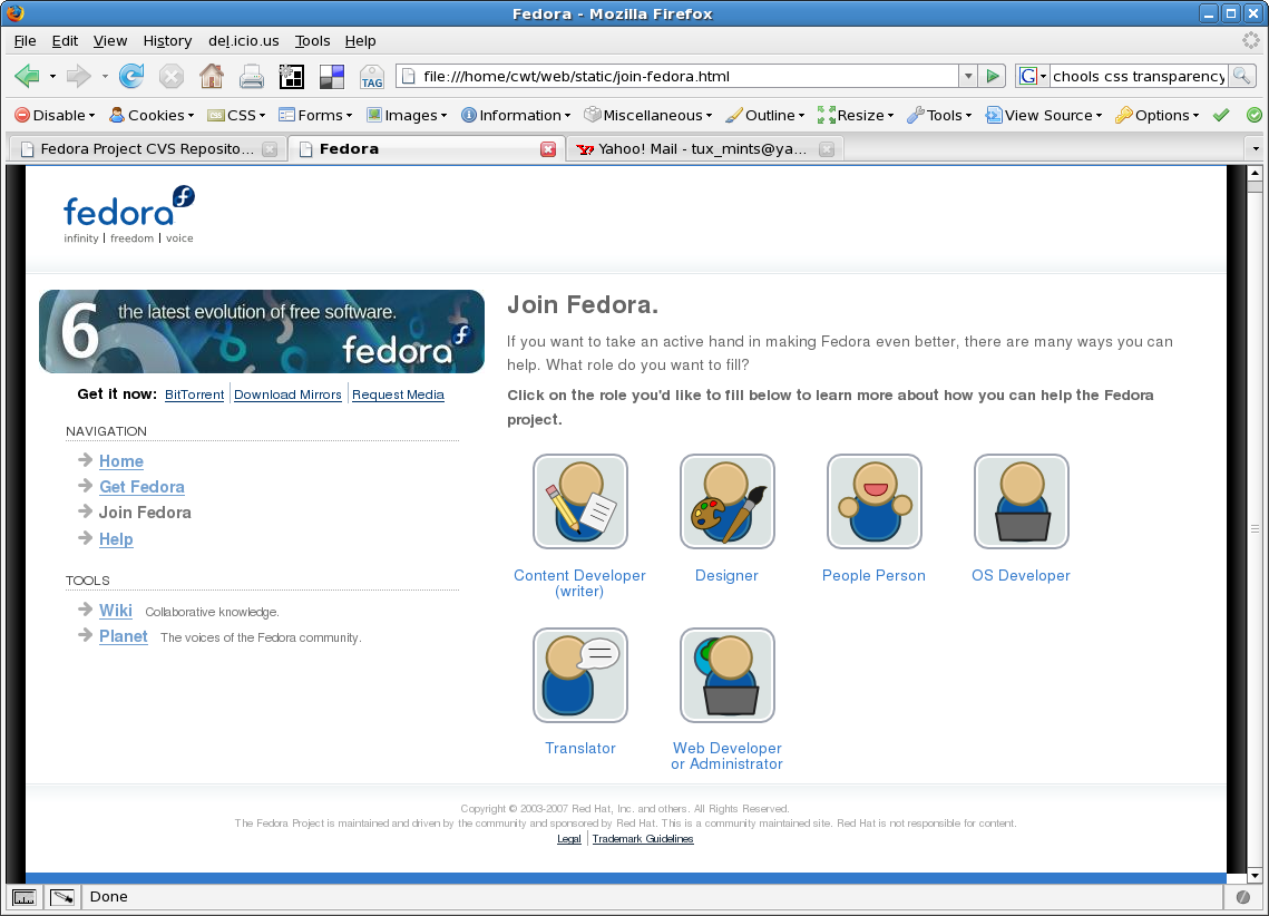
3) Join Fedora:
http://people.redhat.com/duffy/fedora/web/join-fedora.html
Do these look okay? Right info on there, etc?
I'm not quite sure how to go about the learn more page. A run down of
basic information about Fedora, with a section of the new features for
Fedora 7, and a link to the screenshot tour (if there is one available?)
I think the sort of thing most people will be interested in here is a
screenshot tour but we shouldn't have files that big on this small site.
BTW:
fedora logo - 4.7K
f7 now available banner - 8.2K
arrow bullet: 293 bytes
hr graphics: 320 bytes
drop shadows (left/right of screen): 304 bytes
html: ~4.5K/page
Do these seem like reasonable sizes?
~m
3:52 a.m.
On 5/13/07, Máirín Duffy <duffy(a)redhat.com> wrote:
...and a link to the screenshot tour (if there is one available?)
Yup. :)
http://fedoraproject.org/wiki/Tours/Fedora7
Regards,
--
Thomas Chung
http://fedoraproject.org/wiki/ThomasChung

12:01 p.m.
Hi all,
I hope an attachment is ok, as I had no where to post
this, sorry if not.
I started trying to remove the expandable space
between the two main columns (when the browser window
is resized) from duffy's excellent work:
http://people.redhat.com/duffy/fedora/web/static-page-2.html
And ended up with the attached. I rather like it,
but...what does everyone think?
Cheers,
____________________________________________________________________________________
Bored stiff? Loosen up...
Download and play hundreds of games for free on Yahoo! Games.
http://games.yahoo.com/games/front

2:04 p.m.
Hi!
Here's my version with very clean HTML/CSS:
http://fedora.riczho.dyndns.org/static/ (previous version is now at
http://fedora.riczho.dyndns.org/static.old/).
File sizes:
2445 index.html
2217 style.css
17947 images/
22609 total
Some concerns/changes that I've made:
I've lowered the width of the page to only 80%, as (for me) this line
width is easier to read. For similar reasons, I've changed the text
color from gray to black.
With the sidebar, I'm somewhat concerned with putting the image banner
there, as it forces me to set the sidebar width in pixels (I'd much
rather use a relative unit that can scale more easily). Also, I'm a bit
wary of using the -moz-border-radius property for obvious browser
support issues (and with non-gecko browsers, the hard edges *really*
stick out).
For the background, I felt that the original shadows seemed a bit too
"3D," and kind of pop out instead of blending with the page. Also, from
a CSS angle, it'd take either extra markup, doing something weird with
the HTML or body elements, or setting a pixel width on the entire page
to implement such shadows, so I just used a solid border.
Now, my largest issue is probably with non-home pages. Since the left
column needs to be so wide, we lose a *lot* of space under the nav as
the text gets longer. Will we be having a separate design/layout for
the home page?
Other random questions:
* Will the "Get Fedora" page still have the banner/"get it now"
links?
* Does anybody feel that the navigation is in a somewhat awkward place?
Thanks,
Ricky
2:17 p.m.
Hi Ricky,
Ricky Zhou wrote:
Here's my version with very clean HTML/CSS:
http://fedora.riczho.dyndns.org/static/ (previous version is now at
http://fedora.riczho.dyndns.org/static.old/).
I'm not quite sure I agree with all of the visual changes here.
File sizes:
2445 index.html
2217 style.css
17947 images/
22609 total
Some concerns/changes that I've made:
I've lowered the width of the page to only 80%, as (for me) this line
width is easier to read. For similar reasons, I've changed the text
color from gray to black.
I wanted the middle area to take up as much width as possible because I
would like this template at some point to maybe be usable for the wiki.
The wiki needs a great amount of horizontal space. I also wanted to
leave the option open for a right-side banner/control bar.
The text color was changed to grey to give a slightly less-jarring,
lower contrast between the white background which is supposed to me more
readable and I think looks a little slicker.
The text style has been made much smaller which makes it more difficult
to read, and the spacing is off so some of the elements on the page feel
like they don't have enough breathing space.
With the sidebar, I'm somewhat concerned with putting the image banner
there, as it forces me to set the sidebar width in pixels (I'd much
rather use a relative unit that can scale more easily).
The image banner is not scalable, it would not look as good if it was,
and honestly scaling a banner like that is not useful; it doesn't add
any value if it's wider because you'd just be adding empty spcae, not
content if you expanded it.
It's better to scale the main content, the text on the page, to be wider
to make it easier to read on widescreen monitors.
Also, I'm a bit
wary of using the -moz-border-radius property for obvious browser
support issues (and with non-gecko browsers, the hard edges *really*
stick out).
The moz border radius is extremely light though, requires less hacky
html, and takes up no space in images.
For the background, I felt that the original shadows seemed a bit too
"3D," and kind of pop out instead of blending with the page. Also, from
a CSS angle, it'd take either extra markup, doing something weird with
the HTML or body elements, or setting a pixel width on the entire page
to implement such shadows, so I just used a solid border.
I just have one extra div container on the body to implement it. I like
the shadows being very thin, the content area takes the stage more then,
there's more space to work with in the main content area, and I think
the shadows are a nice element. I wanted them to make the content area
pop out more. It's a style that is popular on a lot of websites these days.
Now, my largest issue is probably with non-home pages. Since the left
column needs to be so wide, we lose a *lot* of space under the nav as
the text gets longer. Will we be having a separate design/layout for
the home page?
This is a pretty standard web page layout style. The space underneath
the navigation bar can eventually be used for banners and little info
feeds (eg you could have a little widget that displays the latest few
Fedora News items, etc.)
The width of the banner and navigation bar looks too wide in your page
layout because the main content area only takes up 80%. There's 20%
wasted space + the wasted space under the navigation you're referring to.
Other random questions:
* Will the "Get Fedora" page still have the banner/"get it now"
links?
* Does anybody feel that the navigation is in a somewhat awkward place?
The links on that page then point to the anchors for the specific things
(eg clicking on bittorrent brings up the bittorrent anchor on the page.)
~m
3:11 p.m.
Máirín Duffy wrote:
I wanted the middle area to take up as much width as possible
because
I would like this template at some point to maybe be usable for the
wiki. The wiki needs a great amount of horizontal space. I also
wanted to leave the option open for a right-side banner/control bar.
Aha, I was
actually wondering if this would also be used on the wiki- if
we add a right banner/bar, then this is no longer an issue.
The text color was changed to grey to give a slightly less-jarring,
lower contrast between the white background which is supposed to me
more readable and I think looks a little slicker.
I see where you're coming
from with this- perhaps we can use a slightly
darker grey?
The text style has been made much smaller which makes it more
difficult to read, and the spacing is off so some of the elements on
the page feel like they don't have enough breathing space.
Strange.. I actually
intended to make the text slightly larger (as it
displays on my computer)- may I ask what browser/resolution, etc. you're
viewing it in?
The image banner is not scalable, it would not look as good if it
was, and honestly scaling a banner like that is not useful; it
doesn't add any value if it's wider because you'd just be adding
empty spcae, not content if you expanded it.
I didn't want the image itself to
scale- I just didn't want to allow it
to fix the width of the sidebar. Basically, when the user adjusts the
font size, I would like for the width of the sidebar to change to
accommodate.
The moz border radius is extremely light though, requires less hacky
html, and takes up no space in images.
I definitely prefer it over images, but I
really like the rounded corner
effect and would just like to have it in non-gecko browsers too (it
looks out of place in other browsers).
I just have one extra div container on the body to implement it. I
like the shadows being very thin, the content area takes the stage
more then, there's more space to work with in the main content area,
and I think the shadows are a nice element. I wanted them to make the
content area pop out more. It's a style that is popular on a lot of
websites these days.
As it currently, stands, I feel that the shadow image itself
pops up a
as opposed the the content. I don't think emphasizing the content is
purely about the area that it takes up- when you have some space around
the content, it's emphasized as well, in a different way.
This is a pretty standard web page layout style. The space
underneath
the navigation bar can eventually be used for banners and little
info feeds (eg you could have a little widget that displays the
latest few Fedora News items, etc.)
Those additions would definitely take away from
the impact of the
problem. On the front page, though, I'd probably want news to take a
more central role than a sidebar widget.
The width of the banner and navigation bar looks too wide in your
page layout because the main content area only takes up 80%. There's
20% wasted space + the wasted space under the navigation you're
referring to.
Yes, but that 20% doesn't *look* wasted- I think it serves to
emphasize/contrast the content instead. In
http://people.redhat.com/duffy/fedora/web/static-page-2.html, that space
appears right in the middle, between the sidebar and the content, making
it very obvious to the reader. As I said earlier, none of this will be
an issue once we add right banner/control bar (although we still might
have to reduce the size of the left bar to make more room for it). In
this case, maybe I should have used a unit other than %, displaying the
middle based on the text, not the size of the viewport.
The links on that page then point to the anchors for the specific
things (eg clicking on bittorrent brings up the bittorrent anchor on
the page.)
Ah, perfect, then.
Based on some of your comments, I've made some changes (and a copy with
a wider page, if that looks better):
* http://fedora.riczho.dyndns.org/static/index.html
* http://fedora.riczho.dyndns.org/static/index.wide.html
To illustrate what I was saying with the space under the sidebar, I've
copied the paragraph a few times to make a longer page.
If you have any quick comments, etc. I should be listening in
#fedora-websites/#fedora-admin/checking my e-mail obsessively as always.
Thanks for the comments,
Ricky
12:14 p.m.
Máirín Duffy wrote:
Rahul Sundaram wrote:
> It's about time that we launched that new website of ours. Who is
> working on it and what's the status?
Okay so here's another update;
I've got 3 of the 4 pages:
1) Front page:
http://people.redhat.com/duffy/fedora/web/static-page-2.html (as I
just posted)
2) Get Fedora:
http://people.redhat.com/duffy/fedora/web/get-fedora.html
3) Join Fedora:
http://people.redhat.com/duffy/fedora/web/join-fedora.html
Do these look okay? Right info on there, etc?
Question: Could we make a "Fedora 6" version of this to stick out there
right now and then switch to the F7 pages when they get out? It'd be
nice to battle test some of this stuff before the actual release. What
do you think?
BTW:
fedora logo - 4.7K
f7 now available banner - 8.2K
arrow bullet: 293 bytes
hr graphics: 320 bytes
drop shadows (left/right of screen): 304 bytes
html: ~4.5K/page
Do these seem like reasonable sizes?
At a glance yes, though I may change my mind in a day or so :) let me
crunch some numbers.
-Mike
1:35 p.m.
Mike McGrath wrote:
Question: Could we make a "Fedora 6" version of this to
stick out there
right now and then switch to the F7 pages when they get out? It'd be
nice to battle test some of this stuff before the actual release. What
do you think?
http://people.redhat.com/duffy/fedora/web/static-page-2.html
It's all fc6-ified, what do you think?
~m
1:41 p.m.
Máirín Duffy wrote:
Mike McGrath wrote:
> Question: Could we make a "Fedora 6" version of this to stick out
> there right now and then switch to the F7 pages when they get out?
> It'd be nice to battle test some of this stuff before the actual
> release. What do you think?
http://people.redhat.com/duffy/fedora/web/static-page-2.html
It's all fc6-ified, what do you think?
Learn more links to the tour page instead of a overview. Link to
docs.fedoraproject.org is missing. You are still using the old disclaimer.
Other than that, this is good.
Rahul
1:47 p.m.
Rahul Sundaram wrote:
Learn more links to the tour page instead of a overview.
Where is the overview?
Link to
docs.fedoraproject.org is missing.
Okay, I can add that.
You are still using the old disclaimer.
Where is the new one?
~m
1:50 p.m.
Máirín Duffy wrote:
Rahul Sundaram wrote:
> Learn more links to the tour page instead of a overview.
Where is the overview?
> Link to docs.fedoraproject.org is missing.
Okay, I can add that.
> You are still using the old disclaimer.
Where is the new one?\
oh i got this from your old email, sorry about that.
Still not sure about the overview though?
~m
1:53 p.m.
Máirín Duffy wrote:
Rahul Sundaram wrote:
> Learn more links to the tour page instead of a overview.
Where is the overview?
http://fedoraproject.org/wiki/Overview. Better text in html would be nice.
> Link to docs.fedoraproject.org is missing.
Okay, I can add that.
> You are still using the old disclaimer.
Where is the new one?
Looks like you missed my previous reply to you which has several other
things to consider.
https://www.redhat.com/archives/fedora-websites-list/2007-May/msg00047.html.
Other than that, Dell had requested that we have the powered by Dell
logo at the bottom in exchange for the hardware that they have donated
to us. We have that in fedoraproject.org. Do add that to the html version.
Rahul
1:58 p.m.
Rahul Sundaram wrote:
Looks like you missed my previous reply to you which has several
other
things to consider.
No, I didn't miss it, I just focused in on some things (eg the problems
with the black borders which should now look much better) and kinda
forgot about others :)
Other than that, Dell had requested that we have the powered by Dell
logo at the bottom in exchange for the hardware that they have donated
to us. We have that in fedoraproject.org. Do add that to the html version.
Sure thing.
~m
2:05 p.m.
Máirín Duffy wrote:
Rahul Sundaram wrote:
> Looks like you missed my previous reply to you which has several other
> things to consider.
No, I didn't miss it, I just focused in on some things (eg the problems
with the black borders which should now look much better) and kinda
forgot about others :)
I still still see large amount of black space in the left and in the
bottom in the front page. The other two pages don't have black space in
the bottom but only on the left.
It might be prudent to check how the pages look like in other browsers
like IE, Opera and Konqueror. For IE this might be useful
http://www.tatanka.com.br/ies4linux/page/Main_Page
Opera has a Linux version. Safari in Mac too if you want to be a bit
more comprehensive.
Rahul
2:13 p.m.
Rahul Sundaram wrote:
Máirín Duffy wrote:
> Rahul Sundaram wrote:
>> Looks like you missed my previous reply to you which has several
>> other things to consider.
>
> No, I didn't miss it, I just focused in on some things (eg the
> problems with the black borders which should now look much better) and
> kinda forgot about others :)
I still still see large amount of black space in the left and in the
bottom in the front page. The other two pages don't have black space in
the bottom but only on the left.
Yes, there is black space on the bottom on the front page because of the
shortness of the page content. IF you have a 1024x768 monitor, last I
checked it wasn't there. I don't think it's a big deal and I refactored
it so that the dropshadows along the right side aren't broken as they
were before. This is the way it was designed to look. Is that ok?
It might be prudent to check how the pages look like in other browsers
like IE, Opera and Konqueror. For IE this might be useful
http://www.tatanka.com.br/ies4linux/page/Main_Page
Opera has a Linux version. Safari in Mac too if you want to be a bit
more comprehensive.
How many people actually hit our pages with IE? My guess is less than
20% if even that.
It shouldn't look bad in IE except for the rounded corners but that's
pretty minor.
~m
2:16 p.m.
Máirín Duffy wrote:
Rahul Sundaram wrote:
> Máirín Duffy wrote:
>> Rahul Sundaram wrote:
>>> Looks like you missed my previous reply to you which has several
>>> other things to consider.
>>
>> No, I didn't miss it, I just focused in on some things (eg the
>> problems with the black borders which should now look much better)
>> and kinda forgot about others :)
>
> I still still see large amount of black space in the left and in the
> bottom in the front page. The other two pages don't have black space
> in the bottom but only on the left.
Yes, there is black space on the bottom on the front page because of
the shortness of the page content. IF you have a 1024x768 monitor,
last I checked it wasn't there. I don't think it's a big deal and I
refactored it so that the dropshadows along the right side aren't
broken as they were before. This is the way it was designed to look.
Is that ok?
>
> It might be prudent to check how the pages look like in other
> browsers like IE, Opera and Konqueror. For IE this might be useful
>
> http://www.tatanka.com.br/ies4linux/page/Main_Page
>
> Opera has a Linux version. Safari in Mac too if you want to be a bit
> more comprehensive.
How many people actually hit our pages with IE? My guess is less than
20% if even that.
It shouldn't look bad in IE except for the rounded corners but that's
pretty minor.
Actually IE is 40%
http://fedoraproject.org/awstats/
-Mike
2:21 p.m.
Mike McGrath wrote:
Actually IE is 40%
http://fedoraproject.org/awstats/
Damn!
I'll take a look in IE then.
~m
3:25 p.m.
Máirín Duffy wrote:
Yes, there is black space on the bottom on the front page because of
the
shortness of the page content. IF you have a 1024x768 monitor, last I
checked it wasn't there. I don't think it's a big deal and I refactored
it so that the dropshadows along the right side aren't broken as they
were before. This is the way it was designed to look. Is that ok?
It is pretty ugly in my system. Do you want a screenshot to show this?
Rahul
4:59 p.m.
Rahul Sundaram wrote:
Máirín Duffy wrote:
> Yes, there is black space on the bottom on the front page because of
> the shortness of the page content. IF you have a 1024x768 monitor,
> last I checked it wasn't there. I don't think it's a big deal and I
> refactored it so that the dropshadows along the right side aren't
> broken as they were before. This is the way it was designed to look.
> Is that ok?
It is pretty ugly in my system. Do you want a screenshot to show this?
that would certainly be helpful.
~m
5:18 p.m.
Máirín Duffy wrote:
Rahul Sundaram wrote:
> Máirín Duffy wrote:
>
>> Yes, there is black space on the bottom on the front page because of
>> the shortness of the page content. IF you have a 1024x768 monitor,
>> last I checked it wasn't there. I don't think it's a big deal and I
>> refactored it so that the dropshadows along the right side aren't
>> broken as they were before. This is the way it was designed to look.
>> Is that ok?
>
> It is pretty ugly in my system. Do you want a screenshot to show this?
that would certainly be helpful.
See the screenshots attached to
http://fedoraproject.org/wiki/RahulSundaram/test
Notice how the home page (along with the join page) has black space on
the bottom which the other page doesn't? There was more black space on
the left too but that has reduced to a thin line now.
Rahul
5:20 p.m.
Rahul Sundaram wrote:
See the screenshots attached to
http://fedoraproject.org/wiki/RahulSundaram/test
Notice how the home page (along with the join page) has black space on
the bottom which the other page doesn't? There was more black space on
the left too but that has reduced to a thin line now.
I only see your smolt profile link there, no images?
~m
5:22 p.m.
Máirín Duffy wrote:
Rahul Sundaram wrote:
> See the screenshots attached to
>
> http://fedoraproject.org/wiki/RahulSundaram/test
>
> Notice how the home page (along with the join page) has black space on
> the bottom which the other page doesn't? There was more black space on
> the left too but that has reduced to a thin line now.
I only see your smolt profile link there, no images?
Click on attachments.
Rahul
5:24 p.m.
Rahul Sundaram wrote:
Máirín Duffy wrote:
> Rahul Sundaram wrote:
>> See the screenshots attached to
>>
>> http://fedoraproject.org/wiki/RahulSundaram/test
>>
>> Notice how the home page (along with the join page) has black space
>> on the bottom which the other page doesn't? There was more black
>> space on the left too but that has reduced to a thin line now.
That's by design. IT is displaying as designed.
~m
5:30 p.m.
Máirín Duffy wrote:
Rahul Sundaram wrote:
> Máirín Duffy wrote:
>> Rahul Sundaram wrote:
>>> See the screenshots attached to
>>>
>>> http://fedoraproject.org/wiki/RahulSundaram/test
>>>
>>> Notice how the home page (along with the join page) has black space
>>> on the bottom which the other page doesn't? There was more black
>>> space on the left too but that has reduced to a thin line now.
That's by design. IT is displaying as designed.
Why do you want to display black space in the bottom on the home and
join page but not on get fedora page? I don't understand the need for
black space there by design or why it would be inconsistent across pages.
Rahul
5:32 p.m.
Rahul Sundaram wrote:
Why do you want to display black space in the bottom on the home and
join page but not on get fedora page? I don't understand the need for
black space there by design or why it would be inconsistent across pages.
The get fedora page is longer so it hits the bottom. the other two are
too short.
~m
5:38 p.m.
Máirín Duffy wrote:
Rahul Sundaram wrote:
> Why do you want to display black space in the bottom on the home and
> join page but not on get fedora page? I don't understand the need for
> black space there by design or why it would be inconsistent across pages.
The get fedora page is longer so it hits the bottom. the other two are
too short.
Don't think that looks odd? Having it white instead of black would make
it stand out less.
Rahul
2:14 p.m.
Máirín Duffy wrote:
Mike McGrath wrote:
> Question: Could we make a "Fedora 6" version of this to stick out
> there right now and then switch to the F7 pages when they get out?
> It'd be nice to battle test some of this stuff before the actual
> release. What do you think?
http://people.redhat.com/duffy/fedora/web/static-page-2.html
It's all fc6-ified, what do you think?
Wonderful :) before these go live we should stick / pull them from CVS.
Mo, think you can put them there?
-Mike
8:01 p.m.
Máirín Duffy wrote:
http://people.redhat.com/duffy/fedora/web/static-page-2.html
It's all fc6-ified, what do you think?
Nice- I really like the changes that you
make- looks much more polished
now.
As for the browser bugs that have been mentioned around here, this
version should fix many of them: http://fedora.riczho.dyndns.org/static/
That version was intended to implement your design/content as closely as
possible, with a few tiny changes to fix browser problems, etc. (also, I
may not have gotten your font sizes/colors exactly correct, so please
e-mail me with any visual elements that I messed up).
Summary of changes:
* Instead of displaying a black area, the page extends to the viewport
if the content is too short. (Used method outlined here:
http://test.riczho.dyndns.org/fullheight/).
* I had to bring the content area much closer to the sidebar in order to
get it to display correctly in IE/1024x786
* The roles list may be messed up- I rush-fixed this to use a <ul> and
eliminate the illegal <div> in the <a>, but the pixel dimensions might
make it not scale as easily.
I've tested the CSS in IE 5.5/6/7, Konqueror/Safari, Firefox, and Opera
9. There is an issue with Safari 1024x786 (I think) where the column
drops down. I think this is because of the wide screenshot banner
(maybe we could size it down a bit)?
The markup/CSS should be pretty clean and stable.
And just a side note to any testers around reading this- here are some
useful (and surprisingly fast) sites to get screenshots of a site in IE
5.5/6/7 and Safari:
* http://ipinfo.info/netrenderer/index.php (IE)
* http://browsrcamp.com (Safari)
Hope we can work with this,
Ricky
8:38 p.m.
Ricky Zhou wrote:
Máirín Duffy wrote:
> http://people.redhat.com/duffy/fedora/web/static-page-2.html
>
> It's all fc6-ified, what do you think?
Nice- I really like the changes that you make- looks much more polished
now.
As for the browser bugs that have been mentioned around here, this
version should fix many of them: http://fedora.riczho.dyndns.org/static/
Avoiding black space is good but your content looks cramped and is not
as readable as Duffy's version. Screenshots for comparison at
http://fedoraproject.org/wiki/RahulSundaram/test?action=AttachFile
Rahul
9:04 p.m.
Rahul Sundaram wrote:
Avoiding black space is good but your content looks cramped and is
not
as readable as Duffy's version. Screenshots for comparison at
http://fedoraproject.org/wiki/RahulSundaram/test?action=AttachFile
Hmm.. Strange,
I didn't notice such a discrepancy in my browser
(actually, checking with Firefox here, my versions have always had
larger font sizes than the original).
I've increased the font size now, which should also enlarge some
spacing/improve readability (yay relative units). As for the space
between the sidebar and content, I was forced to move those really close
to get Safari/1024x786 to display properly. Actually, as it stands now,
there is absolutely no way for the fc6 and screenshot banners to display
nicely on 800x600 (just the images sum up to 893px). I mentioned this
issue in my previous mail, so I'll probably wait for advice on that to
change spacing, etc.
Just curious: Do you have an very large screen, or is there some browser
problem that I'm not accounting for? With my previous version, it the
font sizes were already obviously larger than the original (and now,
it's even more apparent).
Thanks for your comments (and looking forward to more suggestions),
Ricky
9:08 p.m.
Ricky Zhou wrote:
Just curious: Do you have an very large screen, or is there some browser
problem that I'm not accounting for? With my previous version, it the
font sizes were already obviously larger than the original (and now,
it's even more apparent).
1280*1024. Firefox 1.5.0.10 that comes with Fedora Core 6. Nothing
strange or uncommon. Everything is stock.
Rahul

12:55 a.m.
On 15/05/07, Ricky Zhou <ricky(a)fedoraproject.org> wrote:
Actually, as it stands now,
there is absolutely no way for the fc6 and screenshot banners to display
nicely on 800x600 (just the images sum up to 893px). I mentioned this
issue in my previous mail, so I'll probably wait for advice on that to
change spacing, etc.
Can the 3 screenshots be chopped up into separate images and floated
so that they stack on top of each other in smaller resolutions?

3:15 a.m.
2Ricky:
Missing padding-left for <div id="get"> can lead to that "Get it
now" can
get very close to left black border with certain font sizes.
Adam Pribyl
7:03 a.m.
On 5/15/07, Adam Pribyl <pribyl(a)lowlevel.cz> wrote:
2Ricky:
Missing padding-left for <div id="get"> can lead to that "Get it
now" can
get very close to left black border with certain font sizes.
Ah, thanks- I added a
bit of space there. I've also separated/floated
the images as some people suggested.
Thanks,
Ricky
6:32 p.m.
Great work. I think these pages are looking great.
It looks like the join page has a minor cosmetic issue
with the black shadowy/3d image on the very bottom
right...it is not extending into the equivalent space
as the blue footer...screenshot attached.
--
Craig
____________________________________________________________________________________
TV dinner still cooling?
Check out "Tonight's Picks" on Yahoo! TV.
http://tv.yahoo.com/
9:30 p.m.
craig thomas wrote:
It looks like the join page has a minor cosmetic issue
with the black shadowy/3d image on the very bottom
right...it is not extending into the equivalent space
as the blue footer...screenshot attached.
Ooh, good catch! I forgot that #wrapper
and footer were separate. I
had to do add a background image on html, but hopefully it won't give
any browser problems.
I also applied the margin fix that you gave (yeah, it looks neater lined
up).
Thanks a lot,
Ricky
6:32 a.m.
--- Ricky Zhou <ricky(a)fedoraproject.org> wrote:
Hi,
I really love the icons on the join page. However, I
do not care for the solid blue-ish-green-ish rollover
state and have been playing with changes. I have been
trying to emulate fedora's default gnome on state
glowey light rollovers (which I like very much) and
was trying to emulate these. I had to start with the
.pngs from the wiki and failed. I've looked for the
layered source files and cannot find them. Do we know
who made the icons on the join page or where the
source files live?
The pages are looking sharp ;-) are we going to want
to integrate this with some other site/code as well ?
Thanks,
--
Craig
____________________________________________________________________________________Pinpoint
customers who are looking for what you sell.
http://searchmarketing.yahoo.com/
7:29 a.m.
craig thomas wrote:
--- Ricky Zhou <ricky(a)fedoraproject.org> wrote:
Hi,
I really love the icons on the join page. However, I
do not care for the solid blue-ish-green-ish rollover
state and have been playing with changes. I have been
trying to emulate fedora's default gnome on state
glowey light rollovers (which I like very much) and
was trying to emulate these. I had to start with the
.pngs from the wiki and failed. I've looked for the
layered source files and cannot find them. Do we know
who made the icons on the join page or where the
source files live?
Cool!! That would be awesome if you could do the glowy thing. I actually
drew those icons at the Boston Fudcon this past fall. I've been going
through my laptop looking for the SVG source but no luck yet. I think I
might have an SVG for them somewhere in the wiki but I don't know where.
I'll look on my other computer and let you know if I found them and if
not I'm sure I can recreate them pretty easily.
~m
9:11 a.m.
Hi Ricky!
Awesome fixes, thanks dude -
Ricky Zhou wrote:
Rahul Sundaram wrote:
I've increased the font size now, which should also enlarge some
spacing/improve readability (yay relative units). As for the space
between the sidebar and content, I was forced to move those really close
to get Safari/1024x786 to display properly. Actually, as it stands now,
there is absolutely no way for the fc6 and screenshot banners to display
nicely on 800x600 (just the images sum up to 893px). I mentioned this
issue in my previous mail, so I'll probably wait for advice on that to
change spacing, etc.
Just curious: Do you have an very large screen, or is there some browser
problem that I'm not accounting for? With my previous version, it the
font sizes were already obviously larger than the original (and now,
it's even more apparent).
I have a 1024x768 laptop and a 1680x1050 widescreen lcd on my desktop
machine, and some of the fonts appear really small for me as well. Are
you sure you haven't set the system wide fonts in your gnome (or kde?)
preferences or in firefox so that they come out smaller?
They are still quite small in the download li tags on the get fedora
page. (http://fedora.riczho.dyndns.org/static/get-fedora.html) The rest
look okay now though.
Re: the screenshots, let me size them down a bit.
~m
9:10 p.m.
--- Rahul Sundaram <sundaram(a)fedoraproject.org> wrote:
Ricky Zhou wrote:
> Máirín Duffy wrote:
>>
http://people.redhat.com/duffy/fedora/web/static-page-2.html
>>
>> It's all fc6-ified, what do you think?
> Nice- I really like the changes that you make-
looks much more polished
> now.
>
> As for the browser bugs that have been mentioned
around here, this
> version should fix many of them:
http://fedora.riczho.dyndns.org/static/
Avoiding black space is good but your content looks
cramped and is not
as readable as Duffy's version. Screenshots for
comparison at
Yeah, a tiny bit cramped, but much less buggy and
visually an improvement overall. I see some alignment
issues as well. But nothing a little more polish
wouldn't take care of...I think this is the best yet
and we should work from this one. It's valid
xhtml/css which also means any template system worth
using will speak it's language. It's cross-browser
compliant as well.
--
Craig
____________________________________________________________________________________
Park yourself in front of a world of choices in alternative vehicles. Visit the Yahoo!
Auto Green Center.
http://autos.yahoo.com/green_center/

2:24 p.m.
On Tue, 2007-05-15 at 10:15 -0400, Máirín Duffy wrote:
Ricky Zhou wrote:
> Hope we can work with this,
+1 awesome work. Let's get this in CVS. Do you know where to put it? (I
don't) :(
How about:
cvs.fedoraproject.org:/cvs/web
A new module? Or just update content within the old module?
If we do the update, the only thing we *cannot* touch is:
/cvs/web/html/docs
/cvs/web/scripts/
/cvs/web/include/
Maybe we should just create a new directory /cvs/web/static. It's
accurate, etc.
I think I have the ACLs to enable what we need; certainly can give it a
shot. We get the added advantage that all CVS changes are emailed to
this list, so the conversation can continue here, too. :)
There are some little alignment/tweaking things I want to do but i
think
it's better to start working out of CVS.
I want to work on the language a bit, etc., and agree CVS is the thing
from here.
- Karsten
--
Karsten Wade, 108 Editor ^ Fedora Documentation Project
Sr. Developer Relations Mgr. | fedoraproject.org/wiki/DocsProject
quaid.108.redhat.com | gpg key: AD0E0C41
////////////////////////////////// \\\\\\\\\\\\\\\\\\\\\\\\\\\\\\\\\\\\
2:35 p.m.
On Tue, 2007-05-15 at 12:24 -0700, Karsten Wade wrote:
Maybe we should just create a new directory /cvs/web/static.
It's
accurate, etc.
Done. Máirín was in the ACLs already, I added the user 'ricky'. I
forgot that you also need to go through the FAS to get access. Go to
this page:
https://admin.fedoraproject.org/accounts/userbox.cgi?_edit=1
At the bottom, under "Add new membership", request the group
'cvsfedora'. I don't have access to approve for that group, but someone
such as Mike does. Once approved, you have to wait for the cronjob to
run (hourly, iirc.)
After that the usual:
export CVS_RSH="ssh"
export CVSROOT=:ext:cvs.fedoraproject.org:/cvs/web
cvs co web
cd web/static
We could probably make the static stuff stand-alone a bit more, but I'd
like ya'll to have a full check out so you can e.g. easily update
docs.fedoraproject.org. :)
- Karsten
--
Karsten Wade, 108 Editor ^ Fedora Documentation Project
Sr. Developer Relations Mgr. | fedoraproject.org/wiki/DocsProject
quaid.108.redhat.com | gpg key: AD0E0C41
////////////////////////////////// \\\\\\\\\\\\\\\\\\\\\\\\\\\\\\\\\\\\
6:03 p.m.
--- Karsten Wade <kwade(a)redhat.com> wrote:
On Tue, 2007-05-15 at 12:24 -0700, Karsten Wade
wrote:
> Maybe we should just create a new directory
/cvs/web/static. It's
> accurate, etc.
Done.
After that the usual:
export CVS_RSH="ssh"
export CVSROOT=:ext:cvs.fedoraproject.org:/cvs/web
cvs co web
cd web/static
Karsten,
Is there any chance of anonymous read access? right
now it seems restricted?
Thanks,
--
Craig
[cwt@jane ~]$ export CVS_RSH="ssh"
[cwt@jane ~]$ export
CVSROOT=:ext:cvs.fedoraproject.org:/cvs/web
[cwt@jane ~]$ cvs co web
The authenticity of host 'cvs.fedoraproject.org
(209.132.176.51)' can't be established.
RSA key fingerprint is
dd:0d:f1:d6:e2:f6:39:cf:ca:6b:03:28:8d:84:3a:d5.
Are you sure you want to continue connecting (yes/no)?
y
Please type 'yes' or 'no': yes
Warning: Permanently added
'cvs.fedoraproject.org,209.132.176.51' (RSA) to the
list of known hosts.
Permission denied (publickey,keyboard-interactive).
cvs [checkout aborted]: end of file from server
(consult above messages if any)
[cwt@jane ~]$
____________________________________________________________________________________
No need to miss a message. Get email on-the-go
with Yahoo! Mail for Mobile. Get started.
http://mobile.yahoo.com/mail
6:07 p.m.
craig thomas wrote:
--- Karsten Wade <kwade(a)redhat.com> wrote:
> On Tue, 2007-05-15 at 12:24 -0700, Karsten Wade
> wrote:
>
>> Maybe we should just create a new directory
>>
> /cvs/web/static. It's
>
>> accurate, etc.
>>
> Done.
> After that the usual:
> export CVS_RSH="ssh"
> export CVSROOT=:ext:cvs.fedoraproject.org:/cvs/web
> cvs co web
> cd web/static
>
Karsten,
Is there any chance of anonymous read access? right
now it seems restricted?
pserver should work or
http://cvs.fedoraproject.org/viewcvs/web/static/?root=fedora
-Mike
8:27 p.m.
--- Mike McGrath <mmcgrath(a)redhat.com> wrote:
http://cvs.fedoraproject.org/viewcvs/web/static/?root=fedora
This works just fine.
--
Craig
____________________________________________________________________________________Need a
vacation? Get great deals
to amazing places on Yahoo! Travel.
http://travel.yahoo.com/
craig thomas wrote:
> --- Karsten Wade <kwade(a)redhat.com> wrote:
>> On Tue, 2007-05-15 at 12:24 -0700, Karsten Wade
>> wrote:
CVSROOT=:ext:cvs.fedoraproject.org:/cvs/web
>> cvs co web
> Is there any chance of anonymous read access?
right
> now it seems restricted?
pserver should work or
I can't get this to work using:
[cwt@jane ~]$ export
CVSROOT=:pserver:anonymous@cvs.fedoraproject.org:/cvs/web
[cwt@jane ~]$ cvs login
Logging in to
:pserver:anonymous@cvs.fedoraproject.org:2401/cvs/web
CVS password:
/cvs/web: no such repository
[cwt@jane ~]$ cvs co web
/cvs/web: no such repository
[cwt@jane ~]$
4:18 a.m.
On Tue, 2007-05-15 at 21:29 -0400, Ricky Zhou wrote:
> [cwt@jane ~]$ export
> CVSROOT=:pserver:anonymous@cvs.fedoraproject.org:/cvs/web
Use CVSROOT=:pserver:anonymous@cvs.fedoraproject.org:/cvs/fedora instead.
Oh, yeah, oops, sorry, thanks.
- Karsten, comma'd
--
Karsten Wade, 108 Editor ^ Fedora Documentation Project
Sr. Developer Relations Mgr. | fedoraproject.org/wiki/DocsProject
quaid.108.redhat.com | gpg key: AD0E0C41
////////////////////////////////// \\\\\\\\\\\\\\\\\\\\\\\\\\\\\\\\\\\\
8:34 p.m.
craig thomas wrote:
--- Mike McGrath <mmcgrath(a)redhat.com> wrote:
> craig thomas wrote:
>
>> --- Karsten Wade <kwade(a)redhat.com> wrote:
>>
>>> On Tue, 2007-05-15 at 12:24 -0700, Karsten Wade
>>> wrote:
>>>
> CVSROOT=:ext:cvs.fedoraproject.org:/cvs/web
>
>>> cvs co web
>>>
>> Is there any chance of anonymous read access?
>>
> right
>
>> now it seems restricted?
>>
> pserver should work or
>
I can't get this to work using:
[cwt@jane ~]$ export
CVSROOT=:pserver:anonymous@cvs.fedoraproject.org:/cvs/web
CVSROOT=:pserver:anonymous@cvs.fedoraproject.org:/cvs/fedora
cvs co web
-Mike
8:41 p.m.
--- Mike McGrath <mmcgrath(a)redhat.com> wrote:
CVSROOT=:pserver:anonymous@cvs.fedoraproject.org:/cvs/fedora
Thank you both.
____________________________________________________________________________________Get
the Yahoo! toolbar and be alerted to new email wherever you're surfing.
http://new.toolbar.yahoo.com/toolbar/features/mail/index.php
7:38 p.m.
Karsten Wade wrote:
At the bottom, under "Add new membership", request the
group
'cvsfedora'. I don't have access to approve for that group, but someone
such as Mike does. Once approved, you have to wait for the cronjob to
run (hourly, iirc.)
OK- I've requested to join cvsfedora- I can import the
files once I'm
approved. Are there any special considerations that I should make with
file paths/URLs in the file? I usually like to stay relative to the
serverroot, but in this case, I made everything relative to the file's
location for easier editing/moving, etc.
Side note: If/when I have access, can I commit that wiki patch to
kindofblue as well? People can then do further testing before making it
live.
Thanks,
Ricky
4:20 a.m.
On Tue, 2007-05-15 at 20:38 -0400, Ricky Zhou wrote:
Karsten Wade wrote:
> At the bottom, under "Add new membership", request the group
> 'cvsfedora'. I don't have access to approve for that group, but
someone
> such as Mike does. Once approved, you have to wait for the cronjob to
> run (hourly, iirc.)
OK- I've requested to join cvsfedora- I can import the files once I'm
approved. Are there any special considerations that I should make with
file paths/URLs in the file? I usually like to stay relative to the
serverroot, but in this case, I made everything relative to the file's
location for easier editing/moving, etc.
Probably a good idea for now; if we are consistent, it is easy to s///g
later. :)
Side note: If/when I have access, can I commit that wiki patch to
kindofblue as well? People can then do further testing before making it
live.
Not the same places, unfortunately. I don't know where that is located.
However, there is a 'web' CVS group that we could use to accumulate ACLs
with.
- Karsten
--
Karsten Wade, 108 Editor ^ Fedora Documentation Project
Sr. Developer Relations Mgr. | fedoraproject.org/wiki/DocsProject
quaid.108.redhat.com | gpg key: AD0E0C41
////////////////////////////////// \\\\\\\\\\\\\\\\\\\\\\\\\\\\\\\\\\\\

4:54 a.m.
Karsten Wade wrote:
On Tue, 2007-05-15 at 20:38 -0400, Ricky Zhou wrote:
> Side note: If/when I have access, can I commit that wiki patch to
> kindofblue as well? People can then do further testing before making it
> live.
Not the same places, unfortunately. I don't know where that is located.
However, there is a 'web' CVS group that we could use to accumulate ACLs
with.
Well, I assumed that it was here:
http://cvs.fedoraproject.org/viewcvs/kindofblue/?root=fedora (these are
the files that I made the patch to). The cvsfedora group should have
commit access to this directory, right?
Thanks,
Ricky

1 a.m.
Máirín Duffy wrote:
Mike McGrath wrote:
> Question: Could we make a "Fedora 6" version of this to stick out
> there right now and then switch to the F7 pages when they get out?
> It'd be nice to battle test some of this stuff before the actual
> release. What do you think?
http://people.redhat.com/duffy/fedora/web/static-page-2.html
It's all fc6-ified, what do you think?
It does not look very good on small screen sizes, for 1024x768 you have
basically to keep the browser full-screen for a correct display of the page.
http://fedoraproject.org/wiki/NicuBuculei?action=AttachFile&do=view&a...
I know the argument about simple users with poor hardware and using all
their application windows maximized, I guess I am in the minority using
a larger screen size and smaller windows.
But how about making the width of the 3 thumbnails dynamic so they wrap
if not enough space?
In the awstats page we don't have any data about screen resolution so I
will use instead the numbers from my own Fedora website: 40.33% of the
visitors use 1024x768, maybe only part of them are not keeping the
browser full screen, but still is a big number.
--
nicu :: http://nicubunu.ro :: http://nicubunu.blogspot.com
Cool Fedora wallpapers: http://fedora.nicubunu.ro/wallpapers/
Open Clip Art Library: http://www.openclipart.org
my Fedora stuff: http://fedora.nicubunu.ro
3:11 a.m.
On Tue, 2007-05-15 at 09:00 +0300, Nicu Buculei wrote:
Máirín Duffy wrote:
> Mike McGrath wrote:
>> Question: Could we make a "Fedora 6" version of this to stick out
>> there right now and then switch to the F7 pages when they get out?
>> It'd be nice to battle test some of this stuff before the actual
>> release. What do you think?
>
> http://people.redhat.com/duffy/fedora/web/static-page-2.html
>
> It's all fc6-ified, what do you think?
It does not look very good on small screen sizes, for 1024x768 you have
basically to keep the browser full-screen for a correct display of the page.
http://fedoraproject.org/wiki/NicuBuculei?action=AttachFile&do=view&a...
I know the argument about simple users with poor hardware and using all
their application windows maximized, I guess I am in the minority using
a larger screen size and smaller windows.
+1
I'm stuck on 1024x768 and I use Gkrellm in a column down the right side,
so I'm always a bit shy of the full width ... plus I don't always have
the browser maximized.
In my experience, many users don't shift from their default resolution.
Considering how often this is 1024x768, we should strike for a width
assumption that is a bit narrower. Myself, I'm most comfortable with
900 wide. People who are using 800 wide displays are used to broken
pages by now. ;-P
But how about making the width of the 3 thumbnails dynamic so they
wrap
if not enough space?
Shift them to vertical or make them smaller, perhaps.
In the awstats page we don't have any data about screen
resolution so I
will use instead the numbers from my own Fedora website: 40.33% of the
visitors use 1024x768, maybe only part of them are not keeping the
browser full screen, but still is a big number.
Significant numbers. I've seen similar before.
- Karsten
--
Karsten Wade, 108 Editor ^ Fedora Documentation Project
Sr. Developer Relations Mgr. | fedoraproject.org/wiki/DocsProject
quaid.108.redhat.com | gpg key: AD0E0C41
////////////////////////////////// \\\\\\\\\\\\\\\\\\\\\\\\\\\\\\\\\\\\
2:39 p.m.
Máirín Duffy wrote:
Rahul Sundaram wrote:
> It's about time that we launched that new website of ours. Who is
> working on it and what's the status?
Okay so here's another update;
I've got 3 of the 4 pages:
1) Front page:
http://people.redhat.com/duffy/fedora/web/static-page-2.html (as I just
posted)
We should launch the website before Fedora 7 is introduced. It would
give us some time to understand how well it scales, get some feedback
etc instead of doing it at release time which invariably means that
everyone will be too busy.
Keep this website as it is but for the launch which I am hoping we can
even do today (Can we Mike?), replace the "Introducing Fedora 7" with
"Welcome to Fedora".
Replace the Fedora 7 image on the side with a FC6 DNA image or skip that
out completely. Drop the last sentence in the With these three changes
the front page becomes generic.
Replace the old disclaimer in the bottom with the new one currently in
fedoraproject.org
"The Fedora Project is maintained and driven by the community and
sponsored by Red Hat.
This is a community maintained site. Red Hat is not responsible for
content."
Why is there so much black space at the end of the page? Is there any
way we can fit in some dynamic news feeds into that page? I think there
is enough space for that.
During F7 launch we should link prominently to the Red Hat press
release, release announcement and release summary.
2) Get Fedora:
http://people.redhat.com/duffy/fedora/web/get-fedora.html
This is very nice but we divide users into those with high and low
bandwidth connections. Nitpicking here but the second section should
also lead those without a net connection too.
I would prefer we highlight the small boot.iso image for network
installation much more here.
Shouldn't we have a good page explaining the differences between
different spins and what target they serve in this page?
3) Join Fedora:
http://people.redhat.com/duffy/fedora/web/join-fedora.html
Do these look okay? Right info on there, etc?
Yes. This is all set.
I'm not quite sure how to go about the learn more page. A run
down of
basic information about Fedora, with a section of the new features for
Fedora 7, and a link to the screenshot tour (if there is one available?)
I think the sort of thing most people will be interested in here is a
screenshot tour but we shouldn't have files that big on this small site.
Just put in a generic overview for now. I will followup with a list of
features and benefits in F7 soon. The tours page in the wiki for FC6 can
be used now. Should be replaced with a link to the F7 tour during launch.
Rahul

3:47 p.m.
-----BEGIN PGP SIGNED MESSAGE-----
Hash: SHA1
Rahul Sundaram schreef:
Máirín Duffy wrote:
> Rahul Sundaram wrote:
>> It's about time that we launched that new website of ours. Who is
>> working on it and what's the status?
>
> Okay so here's another update;
>
> I've got 3 of the 4 pages:
>
> 1) Front page:
> http://people.redhat.com/duffy/fedora/web/static-page-2.html (as I
> just posted)
>
We should launch the website before Fedora 7 is introduced. It would
give us some time to understand how well it scales, get some feedback
etc instead of doing it at release time which invariably means that
everyone will be too busy.
Keep this website as it is but for the launch which I am hoping we can
even do today (Can we Mike?), replace the "Introducing Fedora 7" with
"Welcome to Fedora".
This would be good indeed. Gives visitors some visual reference and
makes it more clear what we're about.
Why is there so much black space at the end of the page? Is there any
way we can fit in some dynamic news feeds into that page? I think there
is enough space for that.
Yeah, the black seems somewhat odd. It even makes the right
sidebar-image disappear, which looks somewhat unpolished.
During F7 launch we should link prominently to the Red Hat press
release, release announcement and release summary.
Why link? Shouldn't we just add them to the site? As in keeping the
people on our site, not Red Hat's, which makes the line between Red Hat
and Fedora somewhat less obscure, imho.
> 2) Get Fedora:
> http://people.redhat.com/duffy/fedora/web/get-fedora.html
This is very nice but we divide users into those with high and low
bandwidth connections. Nitpicking here but the second section should
also lead those without a net connection too.
I would prefer we highlight the small boot.iso image for network
installation much more here.
Shouldn't we have a good page explaining the differences between
different spins and what target they serve in this page?
+ 1
> 3) Join Fedora:
> http://people.redhat.com/duffy/fedora/web/join-fedora.html
>
> Do these look okay? Right info on there, etc?
Yes. This is all set.
Looks fine, but maybe do a 3 column? It seems a bit strange to see 4
roles and then 2 on a widescreen (1280x800)
[snip]
On a totally unrelated note, should we get our heads round L10N? Or not?
Bart
- --
Bart <couf(a)fedoraproject.org> <couf(a)skynet.be>
key fingerprint: 6AAB 544D 3432 D013 776D 3602 ADB6 6B2A D93F 0F93
-----BEGIN PGP SIGNATURE-----
Version: GnuPG v1.4.7 (GNU/Linux)
Comment: Using GnuPG with Fedora - http://enigmail.mozdev.org
iD8DBQFGR3lwrbZrKtk/D5MRAt5PAJ0Wes54XTxuG9tpIhH8a6AuhyV2hgCePn96
nyIFl5QLDuxAJF+SafDFMYM=
=csLx
-----END PGP SIGNATURE-----
3:55 p.m.
Bart Couvreur wrote:
Why link? Shouldn't we just add them to the site? As in keeping the
people on our site, not Red Hat's, which makes the line between Red Hat
and Fedora somewhat less obscure, imho.
Red Hat handles press releases for Fedora which has a budget around that
and won't spread much without the contacts already well established.
Leverage it is IMO better.
On a totally unrelated note, should we get our heads round L10N? Or
not?
As in having a static version of L10N page or have L10N versions of this
pages? I would rather not do the former and the latter should definitely
be done. One more reason to get the website launched early.
Rahul
4:14 p.m.
-----BEGIN PGP SIGNED MESSAGE-----
Hash: SHA1
Rahul Sundaram schreef:
Bart Couvreur wrote:
>
> Why link? Shouldn't we just add them to the site? As in keeping the
> people on our site, not Red Hat's, which makes the line between Red Hat
> and Fedora somewhat less obscure, imho.
Red Hat handles press releases for Fedora which has a budget around that
and won't spread much without the contacts already well established.
Leverage it is IMO better.
Understood
> On a totally unrelated note, should we get our heads round L10N? Or not?
As in having a static version of L10N page or have L10N versions of this
pages? I would rather not do the former and the latter should definitely
be done. One more reason to get the website launched early.
The latter was indeed what I meant. Apache has some nice things to do an
automated check off the language a give the right one (based on
browser-settings). Or should we use a javascript-detection and/or
linking to the seperate lang-pages?.
I suppose Apache would be the way to go.
On an L10N-infrastructural note, we should look at the way the
homepage-module in the docs-project works, to make sure we can let the
translators work with their favorite translation-tools. An xml/xsl
combination seems to do the trick.
Can we get these pages into CVS or something?
- --
Bart <couf(a)fedoraproject.org> <couf(a)skynet.be>
key fingerprint: 6AAB 544D 3432 D013 776D 3602 ADB6 6B2A D93F 0F93
-----BEGIN PGP SIGNATURE-----
Version: GnuPG v1.4.7 (GNU/Linux)
Comment: Using GnuPG with Fedora - http://enigmail.mozdev.org
iD8DBQFGR3+2rbZrKtk/D5MRAk5aAJ0aXgniqqxbxrNI0dVpYeMEdpoUugCgiVvM
V3rYOSWrkbDebD6TfPW168w=
=KpUI
-----END PGP SIGNATURE-----

4:54 p.m.
Rahul,
If you guys give us the final version we can deploy it tomorrow alongside
with the other things im gonna work on.
Mike, Mo, Rahul, how does this work for you guys ?
Paulo
On 5/13/07, Bart Couvreur <couf(a)skynet.be> wrote:
-----BEGIN PGP SIGNED MESSAGE-----
Hash: SHA1
Rahul Sundaram schreef:
> Bart Couvreur wrote:
>>
>> Why link? Shouldn't we just add them to the site? As in keeping the
>> people on our site, not Red Hat's, which makes the line between Red Hat
>> and Fedora somewhat less obscure, imho.
>
> Red Hat handles press releases for Fedora which has a budget around that
> and won't spread much without the contacts already well established.
> Leverage it is IMO better.
Understood
>
>> On a totally unrelated note, should we get our heads round L10N? Or
not?
>
> As in having a static version of L10N page or have L10N versions of this
> pages? I would rather not do the former and the latter should definitely
> be done. One more reason to get the website launched early.
>
The latter was indeed what I meant. Apache has some nice things to do an
automated check off the language a give the right one (based on
browser-settings). Or should we use a javascript-detection and/or
linking to the seperate lang-pages?.
I suppose Apache would be the way to go.
On an L10N-infrastructural note, we should look at the way the
homepage-module in the docs-project works, to make sure we can let the
translators work with their favorite translation-tools. An xml/xsl
combination seems to do the trick.
Can we get these pages into CVS or something?
- --
Bart <couf(a)fedoraproject.org> <couf(a)skynet.be>
key fingerprint: 6AAB 544D 3432 D013 776D 3602 ADB6 6B2A D93F 0F93
-----BEGIN PGP SIGNATURE-----
Version: GnuPG v1.4.7 (GNU/Linux)
Comment: Using GnuPG with Fedora - http://enigmail.mozdev.org
iD8DBQFGR3+2rbZrKtk/D5MRAk5aAJ0aXgniqqxbxrNI0dVpYeMEdpoUugCgiVvM
V3rYOSWrkbDebD6TfPW168w=
=KpUI
-----END PGP SIGNATURE-----
--
Fedora-websites-list mailing list
Fedora-websites-list(a)redhat.com
https://www.redhat.com/mailman/listinfo/fedora-websites-list
6:48 p.m.
Paulo Santos wrote:
Rahul,
If you guys give us the final version we can deploy it tomorrow alongside
with the other things im gonna work on.
Mike, Mo, Rahul, how does this work for you guys ?
Doesn't matter to me, I just want to make the websites team is satisfied
with what is done. I'd still like to get this into plone but thats not
as important as the page itself.
-Mike
3:51 p.m.
-----BEGIN PGP SIGNED MESSAGE-----
Hash: SHA1
Bart Couvreur schreef:
[snip]
On an L10N-infrastructural note, we should look at the way the
homepage-module in the docs-project works, to make sure we can let the
translators work with their favorite translation-tools. An xml/xsl
combination seems to do the trick.
Replying to myself, yay
Just looked at a possible solution for translators: we have the
translate-toolkit in Extras which can do some html2po and vice versa
We just need to get it synced with upstream (0.11 version [1]) to make
sure we get nice po/pot and html out of these tools.
Bart
[1]: https://bugzilla.redhat.com/bugzilla/show_bug.cgi?id=240071
- --
Bart <couf(a)fedoraproject.org> <couf(a)skynet.be>
key fingerprint: 6AAB 544D 3432 D013 776D 3602 ADB6 6B2A D93F 0F93
-----BEGIN PGP SIGNATURE-----
Version: GnuPG v1.4.7 (GNU/Linux)
Comment: Using GnuPG with Fedora - http://enigmail.mozdev.org
iD8DBQFGSMvLrbZrKtk/D5MRAgskAJ9MRABwy5Vn67e01uiP4d8LhOVdYQCeKSjM
04xacRWAfxJXwFzJxdR+OxI=
=4N5p
-----END PGP SIGNATURE-----
4:09 p.m.
-----BEGIN PGP SIGNED MESSAGE-----
Hash: SHA1
Bart Couvreur schreef:
Bart Couvreur schreef:
[snip]
> On an L10N-infrastructural note, we should look at the way the
> homepage-module in the docs-project works, to make sure we can let the
> translators work with their favorite translation-tools. An xml/xsl
> combination seems to do the trick.
Replying to myself, yay
Just looked at a possible solution for translators: we have the
translate-toolkit in Extras which can do some html2po and vice versa
We just need to get it synced with upstream (0.11 version [1]) to make
sure we get nice po/pot and html out of these tools.
Bart
[1]: https://bugzilla.redhat.com/bugzilla/show_bug.cgi?id=240071
Forgot to add this, sorry for resending
Example:
- - English: http://users.skynet.be/couf/fedora/index.html
- - Dutch: http://users.skynet.be/couf/fedora/index-nl.html
- - Generated Pot-file: http://users.skynet.be/couf/fedora/index.pot
Bart
- --
Bart <couf(a)fedoraproject.org> <couf(a)skynet.be>
key fingerprint: 6AAB 544D 3432 D013 776D 3602 ADB6 6B2A D93F 0F93
-----BEGIN PGP SIGNATURE-----
Version: GnuPG v1.4.7 (GNU/Linux)
Comment: Using GnuPG with Fedora - http://enigmail.mozdev.org
iD8DBQFGSNAirbZrKtk/D5MRAqPRAJsE8CRP0Mbp211ezfaQngRTUuJRYwCfVEAF
v4EcUSQTLC0eWA07wHqS+pg=
=wfFf
-----END PGP SIGNATURE-----
6:50 p.m.
Bart Couvreur wrote:
-----BEGIN PGP SIGNED MESSAGE-----
Hash: SHA1
Bart Couvreur schreef:
> Bart Couvreur schreef:
> [snip]
>
>> On an L10N-infrastructural note, we should look at the way the
>> homepage-module in the docs-project works, to make sure we can let the
>> translators work with their favorite translation-tools. An xml/xsl
>> combination seems to do the trick.
>>
> Replying to myself, yay
>
> Just looked at a possible solution for translators: we have the
> translate-toolkit in Extras which can do some html2po and vice versa
>
> We just need to get it synced with upstream (0.11 version [1]) to make
> sure we get nice po/pot and html out of these tools.
>
> Bart
>
> [1]: https://bugzilla.redhat.com/bugzilla/show_bug.cgi?id=240071
>
>
Forgot to add this, sorry for resending
Example:
- - English: http://users.skynet.be/couf/fedora/index.html
- - Dutch: http://users.skynet.be/couf/fedora/index-nl.html
- - Generated Pot-file: http://users.skynet.be/couf/fedora/index.pot
I'm pretty sure this is the plan, but we won't have it in place for fedora7
-Mike
2:03 p.m.
Rahul Sundaram wrote:
Replace the Fedora 7 image on the side with a FC6 DNA image or skip
that
out completely. Drop the last sentence in the With these three changes
the front page becomes generic.
Done
Replace the old disclaimer in the bottom with the new one currently
in
fedoraproject.org
Done
Why is there so much black space at the end of the page? Is there any
way we can fit in some dynamic news feeds into that page? I think there
is enough space for that.
Black space issues should be fixed.
This is static html so unless i use insane javascript to pull in rss
feeds from fedoranews.org (which i can do, it's just insane :) ) this is
not happening with these pages.
I can write php probably to parse the RSS and display but it's probably
better if someone else does that and I can write a style for it. But I
thought the point of these pages was to be as light as possible for the
launch.
During F7 launch we should link prominently to the Red Hat press
release, release announcement and release summary.
+1
> 2) Get Fedora:
> http://people.redhat.com/duffy/fedora/web/get-fedora.html
This is very nice but we divide users into those with high and low
bandwidth connections.
Why is that a problem?
Nitpicking here but the second section should
also lead those without a net connection too.
Okay will do
I would prefer we highlight the small boot.iso image for network
installation much more here.
Can you give me some text for that? Honestly the wiki page does a great
job with all of this but I don't want to parrot the whole page. I want
this to be short and simple.
Do that many people really download the boot.iso image and do network
installs?
Shouldn't we have a good page explaining the differences between
different spins and what target they serve in this page?
I have no idea what the differences are between the different spins, I
don't even know what they are at this point. If you think this is really
important, can you point me to or draft some text to explain it?
Thinking about this we're going to be making it very difficult for
someone to just click a link and download what they want. Maybe the
download page should be refactored for each of the different spins? And
link directly?
~m
2:26 p.m.
Máirín Duffy wrote:
Black space issues should be fixed.
Not yet. See my other mail.
I can write php probably to parse the RSS and display but it's
probably
better if someone else does that and I can write a style for it. But I
thought the point of these pages was to be as light as possible for the
launch.
It is better to avoid PHP since we don't have that in Fedora
infrastructure. Post launch it would be nice to have some RSS feed for
news too. Maybe we can get Plone up and running by then.
> During F7 launch we should link prominently to the Red Hat press
> release, release announcement and release summary.
+1
If you prepare and keep ready the Fedora 7 pages we can replace the ones
we are going to use easily.
>> 2) Get Fedora:
>> http://people.redhat.com/duffy/fedora/web/get-fedora.html
>
> This is very nice but we divide users into those with high and low
> bandwidth connections.
Why is that a problem?
Not a problem if you choose the wording to accommodate users without a
net connection which you already agree with.
> I would prefer we highlight the small boot.iso image for network
> installation much more here.
Can you give me some text for that? Honestly the wiki page does a great
job with all of this but I don't want to parrot the whole page. I want
this to be short and simple.
Do that many people really download the boot.iso image and do network
installs?
Many people are simply not aware of it and still think Fedora doesn't
have a network installation feature.
Here is some sample text:
Generic version:
All ISO images of Fedora support a network installation feature which
you can use to install Fedora over a http/ftp/nfs network and can be
controlled remotely using VNC. A small (less than 10 MB) boot.iso image
is available from under the os/images folder in your favorite mirror.
You can access the network installation feature by entering the
"askmethod" option in the boot prompt. Read the Fedora installation
guide (link to http://docs.fedoraproject.org/install-guide/) for more
details.
Alternatively a FC6 specific version:
All ISO images of Fedora support a network installation feature which
you can use to install Fedora over a http/ftp/nfs network and can be
controlled remotely using VNC. A small (7.9 MB) boot.iso image is
available from
http://download.fedora.redhat.com/pub/fedora/linux/core/6/i386/os/images/
or in your favorite mirror. You can access the network installation
feature by entering the "askmethod" option in the boot prompt. Read the
Fedora installation guide (link to
http://docs.fedoraproject.org/install-guide/fc6/en/sn-alt-install-method....)
for more details.
> Shouldn't we have a good page explaining the differences
between
> different spins and what target they serve in this page?
I have no idea what the differences are between the different spins, I
don't even know what they are at this point. If you think this is really
important, can you point me to or draft some text to explain it?
Thinking about this we're going to be making it very difficult for
someone to just click a link and download what they want. Maybe the
download page should be refactored for each of the different spins? And
link directly?
Yep. Don't worry about this for now for the FC6 pages. I will write
about the different spins before Fedora 7 release.
Rahul
2:28 p.m.
Rahul Sundaram wrote:
Máirín Duffy wrote:
> Black space issues should be fixed.
Not yet. See my other mail.
Yes, as I wrote, it is now working as designed.
> Why is that a problem?
Not a problem if you choose the wording to accommodate users without a
net connection which you already agree with.
Oh okay.
>> I would prefer we highlight the small boot.iso image for network
>> installation much more here.
>
> Can you give me some text for that? Honestly the wiki page does a
> great job with all of this but I don't want to parrot the whole page.
> I want this to be short and simple.
>
> Do that many people really download the boot.iso image and do network
> installs?
Many people are simply not aware of it and still think Fedora doesn't
have a network installation feature.
Here is some sample text:
Generic version:
All ISO images of Fedora support a network installation feature which
you can use to install Fedora over a http/ftp/nfs network and can be
controlled remotely using VNC. A small (less than 10 MB) boot.iso image
is available from under the os/images folder in your favorite mirror.
You can access the network installation feature by entering the
"askmethod" option in the boot prompt. Read the Fedora installation
guide (link to http://docs.fedoraproject.org/install-guide/) for more
details.
Alternatively a FC6 specific version:
All ISO images of Fedora support a network installation feature which
you can use to install Fedora over a http/ftp/nfs network and can be
controlled remotely using VNC. A small (7.9 MB) boot.iso image is
available from
http://download.fedora.redhat.com/pub/fedora/linux/core/6/i386/os/images/
or in your favorite mirror. You can access the network installation
feature by entering the "askmethod" option in the boot prompt. Read the
Fedora installation guide (link to
http://docs.fedoraproject.org/install-guide/fc6/en/sn-alt-install-method....)
for more details.
Great, I'll add this in! Thanks!!
>> Shouldn't we have a good page explaining the differences between
>> different spins and what target they serve in this page?
>
> I have no idea what the differences are between the different spins, I
> don't even know what they are at this point. If you think this is
> really important, can you point me to or draft some text to explain it?
>
> Thinking about this we're going to be making it very difficult for
> someone to just click a link and download what they want. Maybe the
> download page should be refactored for each of the different spins?
> And link directly?
Yep. Don't worry about this for now for the FC6 pages. I will write
about the different spins before Fedora 7 release.
Okay thanks!
~m
2:46 p.m.
On 5/14/07, Máirín Duffy <duffy(a)redhat.com> wrote:
This is static html so unless i use insane javascript to pull in rss
feeds from fedoranews.org (which i can do, it's just insane :) ) this is
not happening with these pages.
I'm sorry. What are we talking about here?
We do not want any RSS feed from fedoranews.org.
We should have our own RSS feed from fedoraproject.org.
Eventually, we should use Plone for such requirements.
--
Thomas Chung
http://fedoraproject.org/wiki/ThomasChung
2:30 p.m.
Máirín Duffy wrote:
Rahul Sundaram wrote:
> It's about time that we launched that new website of ours. Who is
> working on it and what's the status?
Okay so here's another update;
I've got 3 of the 4 pages:
1) Front page:
http://people.redhat.com/duffy/fedora/web/static-page-2.html (as I just
posted)
Another feedback before you start putting things in CVS, please change
the wording in the front page to the following.
"The Fedora Project is a collection of projects sponsored by Red Hat,
and developed as a partnership between the open source community and Red
Hat engineers. The goal of Fedora? The rapid progress of free and open
source software and content. Public forums. Open processes. Rapid
innovation. Meritocracy and transparency. All in pursuit of the best
operating system and platform that free software (link to
http://www.fsf.org/licensing/essays/free-sw.html) can provide."
"Fedora is Linux based operating system and platform that showcases the
the best combination of robust and latest free and open source software.
Fedora is always free for anyone to use, modify, and distribute. It is
built by people across the globe who work together as a community: the
Fedora Project. The Fedora Project is open and anyone is welcome to join.
"The Fedora Project leads the advancement of free and open source
software. By using Fedora, the best of software created by the Linux and
Free software community is in your hands."
Rahul
2:37 p.m.
On Wed, 2007-05-16 at 01:00 +0530, Rahul Sundaram wrote:
Máirín Duffy wrote:
> Rahul Sundaram wrote:
>> It's about time that we launched that new website of ours. Who is
>> working on it and what's the status?
>
> Okay so here's another update;
>
> I've got 3 of the 4 pages:
>
> 1) Front page:
> http://people.redhat.com/duffy/fedora/web/static-page-2.html (as I just
> posted)
Another feedback before you start putting things in CVS, please change
the wording in the front page to the following.
-1
Let's get it in CVS, then make changes to the wording. I have more that
I want to touch than just what you offered, and we can have a better
record in collaboration through CVS. All changes come to this list, so
you'll have plenty of chances to comment without having to get your
hands dirty in CVS. ;-)
- Karsten
--
Karsten Wade, 108 Editor ^ Fedora Documentation Project
Sr. Developer Relations Mgr. | fedoraproject.org/wiki/DocsProject
quaid.108.redhat.com | gpg key: AD0E0C41
////////////////////////////////// \\\\\\\\\\\\\\\\\\\\\\\\\\\\\\\\\\\\
2:40 p.m.
Karsten Wade wrote:
On Wed, 2007-05-16 at 01:00 +0530, Rahul Sundaram wrote:
> Máirín Duffy wrote:
>> Rahul Sundaram wrote:
>>> It's about time that we launched that new website of ours. Who is
>>> working on it and what's the status?
>> Okay so here's another update;
>>
>> I've got 3 of the 4 pages:
>>
>> 1) Front page:
>> http://people.redhat.com/duffy/fedora/web/static-page-2.html (as I just
>> posted)
> Another feedback before you start putting things in CVS, please change
> the wording in the front page to the following.
-1
Let's get it in CVS, then make changes to the wording.
We have made changes via discussion in this list. What difference does
this one change going to make?
Rahul
3:11 p.m.
Rahul Sundaram wrote:
We have made changes via discussion in this list. What difference
does
this one change going to make?
I think the point is more it is not absolutely necessary to change the
text before putting it into CVS since it will definitely change after
its put into CVS.
~m
2:46 p.m.
-----BEGIN PGP SIGNED MESSAGE-----
Hash: SHA1
Karsten Wade schreef:
On Wed, 2007-05-16 at 01:00 +0530, Rahul Sundaram wrote:
> Máirín Duffy wrote:
>> Rahul Sundaram wrote:
>>> It's about time that we launched that new website of ours. Who is
>>> working on it and what's the status?
>> Okay so here's another update;
>>
>> I've got 3 of the 4 pages:
>>
>> 1) Front page:
>> http://people.redhat.com/duffy/fedora/web/static-page-2.html (as I just
>> posted)
> Another feedback before you start putting things in CVS, please change
> the wording in the front page to the following.
-1
Let's get it in CVS, then make changes to the wording. I have more that
I want to touch than just what you offered, and we can have a better
record in collaboration through CVS.
+1 here
All changes come to this list, so
you'll have plenty of chances to comment without having to get
your
hands dirty in CVS.
Just wondering, about this, I seem to be missing like everything since
20 April. Is the syncmail script not working anymore?
- Karsten
Bart
- --
Bart <couf(a)fedoraproject.org> <couf(a)skynet.be>
key fingerprint: 6AAB 544D 3432 D013 776D 3602 ADB6 6B2A D93F 0F93
-----BEGIN PGP SIGNATURE-----
Version: GnuPG v1.4.7 (GNU/Linux)
Comment: Using GnuPG with Fedora - http://enigmail.mozdev.org
iD8DBQFGSg4srbZrKtk/D5MRAvjBAJ4iMXdo5QXM2CIHoNYss1OVgF8fmQCfdBrb
l/qn0qtWYo2hkDgpd0NtPvA=
=BhwW
-----END PGP SIGNATURE-----
4:01 a.m.
On Tue, 2007-05-15 at 21:46 +0200, Bart Couvreur wrote:
Just wondering, about this, I seem to be missing like everything
since
20 April. Is the syncmail script not working anymore?
Mailman config change has it auto-discarding non-member postings, which
unfortunately included the CVS commit messages. As you've seen, this
was fixed by explicitly allowing the non-subscribing poster. :)
- Karsten
--
Karsten Wade, 108 Editor ^ Fedora Documentation Project
Sr. Developer Relations Mgr. | fedoraproject.org/wiki/DocsProject
quaid.108.redhat.com | gpg key: AD0E0C41
////////////////////////////////// \\\\\\\\\\\\\\\\\\\\\\\\\\\\\\\\\\\\
3:10 p.m.
Rahul Sundaram wrote:
"The Fedora Project is a collection of projects sponsored by Red
Hat,
and developed as a partnership between the open source community and Red
Hat engineers. The goal of Fedora? The rapid progress of free and open
source software and content. Public forums. Open processes. Rapid
innovation. Meritocracy and transparency. All in pursuit of the best
operating system and platform that free software (link to
http://www.fsf.org/licensing/essays/free-sw.html) can provide."
"Fedora is Linux based operating system and platform that showcases the
the best combination of robust and latest free and open source software.
Fedora is always free for anyone to use, modify, and distribute. It is
built by people across the globe who work together as a community: the
Fedora Project. The Fedora Project is open and anyone is welcome to join.
"The Fedora Project leads the advancement of free and open source
software. By using Fedora, the best of software created by the Linux and
Free software community is in your hands."
The first paragraph is too long and too fluffy.
The top two things people are going to want to do from this page are
(well by my guess, which may be wrong, but):
1) Download Fedora.
2) Figure out what Fedora is, because they have no clue.
#1 people won't even read the text.
The #2 people are newbies and need things explained simply and
concisely. We don't want to scare off the #2 people because they are
potential users and contributors. For them, I think it's best to leave
the extended 'what is the Fedora community' discussion for behind the
'Learn More' link. We hint enough about it in the two paragraphs that
are on the site right now. Hopefully that bit is enticing enough that
they'll want to learn more.
I explain what Linux and Fedora are to my seatmates on planes all the
time, and I think if I started spewing off that first suggested
paragraph their eyes would glaze over and they'd put their headsets on,
not really understanding *what* I was talking about. Instead I start
with paragraphs #2 and #3 (an operating system is something solid,
something they use everyday. I have to make many comparisons to Windows
and Mac OS X before they 'get' it. An open community is not something
unfortunately that everybody is a member of and understands so it's
difficult to draw understandable parallels.), get them interested enough
to download, and if it doesn't seem like I'll make much progress
explaining the other stuff I let it be.
Anyway, that is my rationale for the text that is there already. It's
never good to have a deluge of text on the front page anyway (it should
be an 'elevator pitch,' not a detailed lecture) and I think your
suggestion just makes it too long. Warren and I sat down for a couple
hours (at least) and brainstormed up with what is there, carefully
considering all of the above. It's probably not perfect and I don't
doubt it could use a reworking or improvements, but I don't think a good
solution is to just tack on more stuff, rather to define what message is
the most important to convey and defer the other stuff to a link under it.
Just so you know that that text, in particular, was not just filler that
I pulled out of a hat. :)
~m
3:47 p.m.
Máirín Duffy wrote:
Rahul Sundaram wrote:
> "The Fedora Project is a collection of projects sponsored by Red Hat,
> and developed as a partnership between the open source community and
> Red Hat engineers. The goal of Fedora? The rapid progress of free and
> open source software and content. Public forums. Open processes. Rapid
> innovation. Meritocracy and transparency. All in pursuit of the best
> operating system and platform that free software (link to
> http://www.fsf.org/licensing/essays/free-sw.html) can provide."
>
> "Fedora is Linux based operating system and platform that showcases
> the the best combination of robust and latest free and open source
> software. Fedora is always free for anyone to use, modify, and
> distribute. It is built by people across the globe who work together
> as a community: the Fedora Project. The Fedora Project is open and
> anyone is welcome to join.
>
> "The Fedora Project leads the advancement of free and open source
> software. By using Fedora, the best of software created by the Linux
> and Free software community is in your hands."
The first paragraph is too long and too fluffy.
Fluffy, yea but but the text you have has two issues that I can spot.
Defining Linux as the operating system instead of Fedora as a Linux
based operating system runs us straight into the Linux vs GNU/Linux
debate which we have carefully sidestepped before.
The last sentence "leading edge" is too close to "bleeding edge". I
would like to emphasize a bit more on robustness too.
Rahul
3:52 p.m.
Rahul Sundaram wrote:
Fluffy, yea but but the text you have has two issues that I can spot.
Defining Linux as the operating system instead of Fedora as a Linux
based operating system runs us straight into the Linux vs GNU/Linux
debate which we have carefully sidestepped before.
People know what "Linux" is.
The last sentence "leading edge" is too close to
"bleeding edge". I
would like to emphasize a bit more on robustness too.
I disagree on that point but then again I'm not a professional writer.
~m
5:05 p.m.
Máirín Duffy wrote:
Rahul Sundaram wrote:
> Fluffy, yea but but the text you have has two issues that I can spot.
> Defining Linux as the operating system instead of Fedora as a Linux
> based operating system runs us straight into the Linux vs GNU/Linux
> debate which we have carefully sidestepped before.
People know what "Linux" is.
Right. Changing from "Fedora is a linux operating system" to "Fedora is
a Linux based operating system" doesn't change that.
> The last sentence "leading edge" is too close to "bleeding edge".
I
> would like to emphasize a bit more on robustness too.
I disagree on that point but then again I'm not a professional writer.
Well I am, atleast technically. Karsten?
Rahul
4:16 a.m.
On Wed, 2007-05-16 at 03:35 +0530, Rahul Sundaram wrote:
Máirín Duffy wrote:
> Rahul Sundaram wrote:
>> Fluffy, yea but but the text you have has two issues that I can spot.
>> Defining Linux as the operating system instead of Fedora as a Linux
>> based operating system runs us straight into the Linux vs GNU/Linux
>> debate which we have carefully sidestepped before.
>
> People know what "Linux" is.
Right. Changing from "Fedora is a linux operating system" to "Fedora is
a Linux based operating system" doesn't change that.
Let's look at "Linux-based" and roll it around our tongues for a few
days. I get Rahul's point, and if we can avoid baiting the trolls by
adding six characters, I'm for it. :)
>> The last sentence "leading edge" is too close to
"bleeding edge". I
>> would like to emphasize a bit more on robustness too.
>
> I disagree on that point but then again I'm not a professional writer.
Well I am, atleast technically. Karsten?
Naturally I'm thoughtful on this area for a different reason.
"Leading-edge" was old(er) wording, maybe it left because it was too
close to "bleeding-edge", not sure about that. Anyway, it was a phrase
I am still not sure about. Sometimes it seems like a nice compromise
from bleeding; not quite at the sharp part, but almost there, like this
close: > <
I guess the point for me is that "leading" and "bleeding" are subject
to
interpretation and are thusly either hyperbolic or inaccurate. It never
means quite the same thing to two different people. Also, both terms
seem to me to be reactions to the overused "cutting edge." Oi, these
gerunds!
Anyway, all that said, I still don't have a solution. More words is not
the answer. I'm actually tempted to go with fewer, but "... the edge of
software created by ..." doesn't sound right, as-is.
... still thinking ...
- Karsten
--
Karsten Wade, 108 Editor ^ Fedora Documentation Project
Sr. Developer Relations Mgr. | fedoraproject.org/wiki/DocsProject
quaid.108.redhat.com | gpg key: AD0E0C41
////////////////////////////////// \\\\\\\\\\\\\\\\\\\\\\\\\\\\\\\\\\\\
11:07 p.m.
On Thu, 2007-05-17 at 02:16 -0700, Karsten Wade wrote:
Naturally I'm thoughtful on this area for a different reason.
[snip discourse]
Oh, I finally got what was disturbing me. It is one of those
mixed-metaphor things. How do you "hold in your hands" the
"leading-edge"?
Or to put it another way, when you pick up a knife/sword, do you hold it
by the "leading-edge"?
I'll commit an idea I'm working on (when CVS is available again.) If I
can't settle on something, I'll bring it back here for more beating.
- Karsten
--
Karsten Wade, 108 Editor ^ Fedora Documentation Project
Sr. Developer Relations Mgr. | fedoraproject.org/wiki/DocsProject
quaid.108.redhat.com | gpg key: AD0E0C41
////////////////////////////////// \\\\\\\\\\\\\\\\\\\\\\\\\\\\\\\\\\\\

2:48 a.m.
On 5/18/07, Karsten Wade <kwade(a)redhat.com> wrote:
On Thu, 2007-05-17 at 02:16 -0700, Karsten Wade wrote:
> Naturally I'm thoughtful on this area for a different reason.
[snip discourse]
Oh, I finally got what was disturbing me. It is one of those
mixed-metaphor things. How do you "hold in your hands" the
"leading-edge"?
Or to put it another way, when you pick up a knife/sword, do you hold it
by the "leading-edge"?
Good "point". That was "sharp" of you to see that. Continue to
apply
"Occam's razor".
John Babich
Volunteer, Fedora Project

3:58 p.m.
Máirín Duffy said the following on 05/15/2007 01:10 PM Pacific Time:
Rahul Sundaram wrote:
> "The Fedora Project is a collection of projects sponsored by Red Hat,
> and developed as a partnership between the open source community and
> Red Hat engineers. The goal of Fedora? The rapid progress of free and
> open source software and content. Public forums. Open processes. Rapid
> innovation. Meritocracy and transparency. All in pursuit of the best
> operating system and platform that free software (link to
> http://www.fsf.org/licensing/essays/free-sw.html) can provide."
>
> "Fedora is Linux based operating system and platform that showcases
> the the best combination of robust and latest free and open source
> software. Fedora is always free for anyone to use, modify, and
> distribute. It is built by people across the globe who work together
> as a community: the Fedora Project. The Fedora Project is open and
> anyone is welcome to join.
>
> "The Fedora Project leads the advancement of free and open source
> software. By using Fedora, the best of software created by the Linux
> and Free software community is in your hands."
The first paragraph is too long and too fluffy.
The top two things people are going to want to do from this page are
(well by my guess, which may be wrong, but):
1) Download Fedora.
2) Figure out what Fedora is, because they have no clue.
#1 people won't even read the text.
The #2 people are newbies and need things explained simply and
concisely. We don't want to scare off the #2 people because they are
potential users and contributors. For them, I think it's best to leave
the extended 'what is the Fedora community' discussion for behind the
'Learn More' link. We hint enough about it in the two paragraphs that
are on the site right now. Hopefully that bit is enticing enough that
they'll want to learn more.
I explain what Linux and Fedora are to my seatmates on planes all the
time, and I think if I started spewing off that first suggested
paragraph their eyes would glaze over and they'd put their headsets on,
not really understanding *what* I was talking about. Instead I start
with paragraphs #2 and #3 (an operating system is something solid,
something they use everyday. I have to make many comparisons to Windows
and Mac OS X before they 'get' it. An open community is not something
unfortunately that everybody is a member of and understands so it's
difficult to draw understandable parallels.), get them interested enough
to download, and if it doesn't seem like I'll make much progress
explaining the other stuff I let it be.
I completely agree. Less text is better. Post all of the detailed "what we
are, how it all works, etc." in a sub-link. At the front page let people choose what
they want to find out more about.
John
John
6248
days inactive
6256
days old
websites@lists.fedoraproject.org
89 comments
16 participants
participants (16)
-
 Adam Pribyl
 -
 Andrew Myers
 -
 Bart Couvreur
 -
 craig thomas
 -
 Damien Durand
 -
 John Babich
 -
 John Poelstra
 -
 Karsten Wade
 -
 Matthias Clasen
 -
 Mike McGrath
 -
 Máirín Duffy
 -
 Nicu Buculei
 -
 Paulo Santos
 -
 Rahul Sundaram
 -
 Ricky Zhou
 -
 Thomas Chung