Re: [Design-team] Fedora Magazine logo ideas

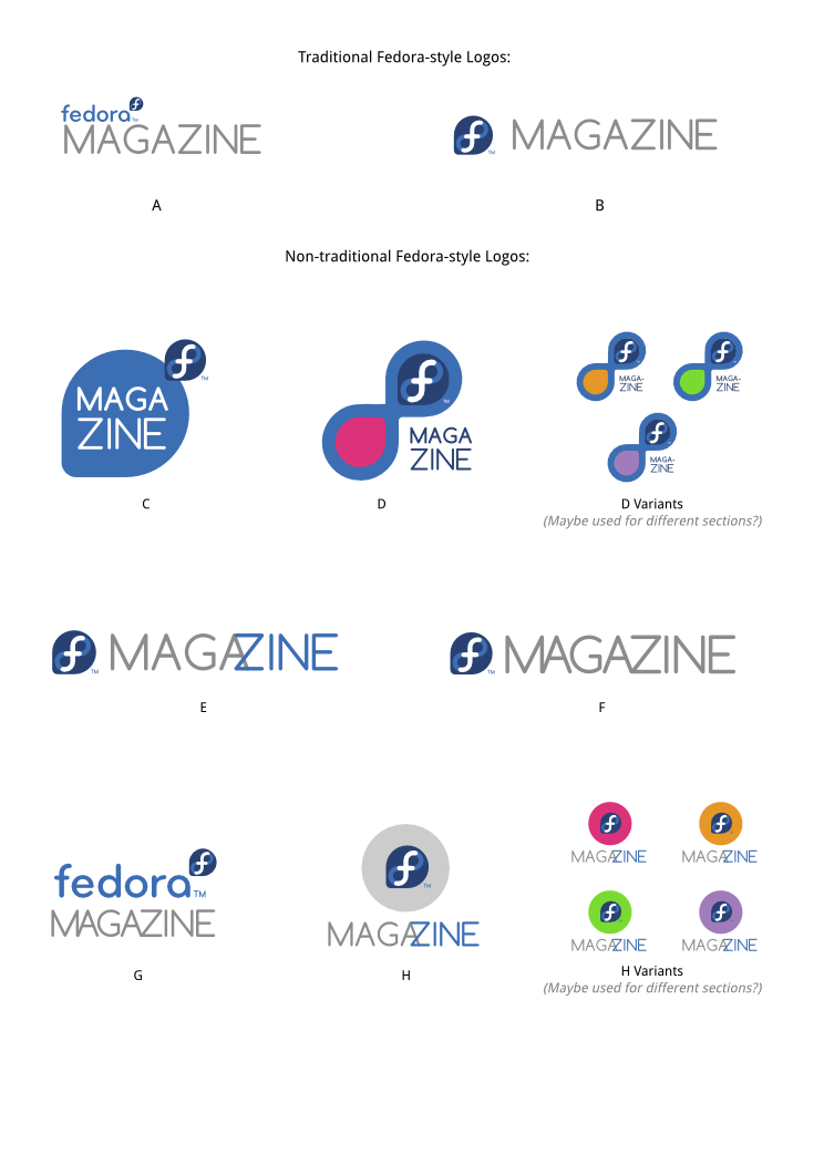
I'm not a fan of D or the variants; I think the Fedora logo, which should
be the dominant element, gets overwhelmed, then you go through a thought
process of "oh, the infinity symbol again, I get it," which is too much
thinking for a logo.
I like C better; it adds an extra element to create a new look for a
magazine but still honors the original logo. But I thought the Fedora logo
portion was too small so I made a version with the proportions changed.
png of just logo C:
https://www.dropbox.com/s/pqi6qanhry0qqec/fedora-mag-logo-C-Chestek.png
svg of all of them, with a revised C:
https://www.dropbox.com/s/27723svk97t94nd/fedora-mag-logos_ideas-chestek.svg
I have to figure out how to set up a page on the Fedora website.
Pam
On Thu, Dec 13, 2012 at 8:13 AM, Ruth Suehle <rsuehle(a)gmail.com> wrote:
On Thu, Dec 13, 2012 at 7:00 AM, <
design-team-request(a)lists.fedoraproject.org> wrote:
>
>
> http://duffy.fedorapeople.org/art/logos/fedoramag/fedora-mag-logos_ideas-...
> \
>
I like B, and I like D with the variants. I could also see some potential
on postcards or shirts to have images instead of colors in the variants.
The first thing that sprung to mind was if it was strange to use some kind
of radio image, since we're broadcasting information, and the initials are
FM. But that's also a bit beyond the usual Fedora [Thing] logo style.
Ruth
_______________________________________________
design-team mailing list
design-team(a)lists.fedoraproject.org
https://admin.fedoraproject.org/mailman/listinfo/design-team
Attachments:
- attachment.html (text/html — 2.8 KB)