Re: [Design-team] Fedora 10 year anniversary logo ideas?

On Mon, 2012-12-10 at 03:19 +0100, S.Kemter wrote:
Hi,
2012/12/6 Martin Sourada <martin.sourada(a)gmail.com>
Hi,
On Thu, 06 Dec 2012 16:41:04 -0500
Máirín Duffy wrote:
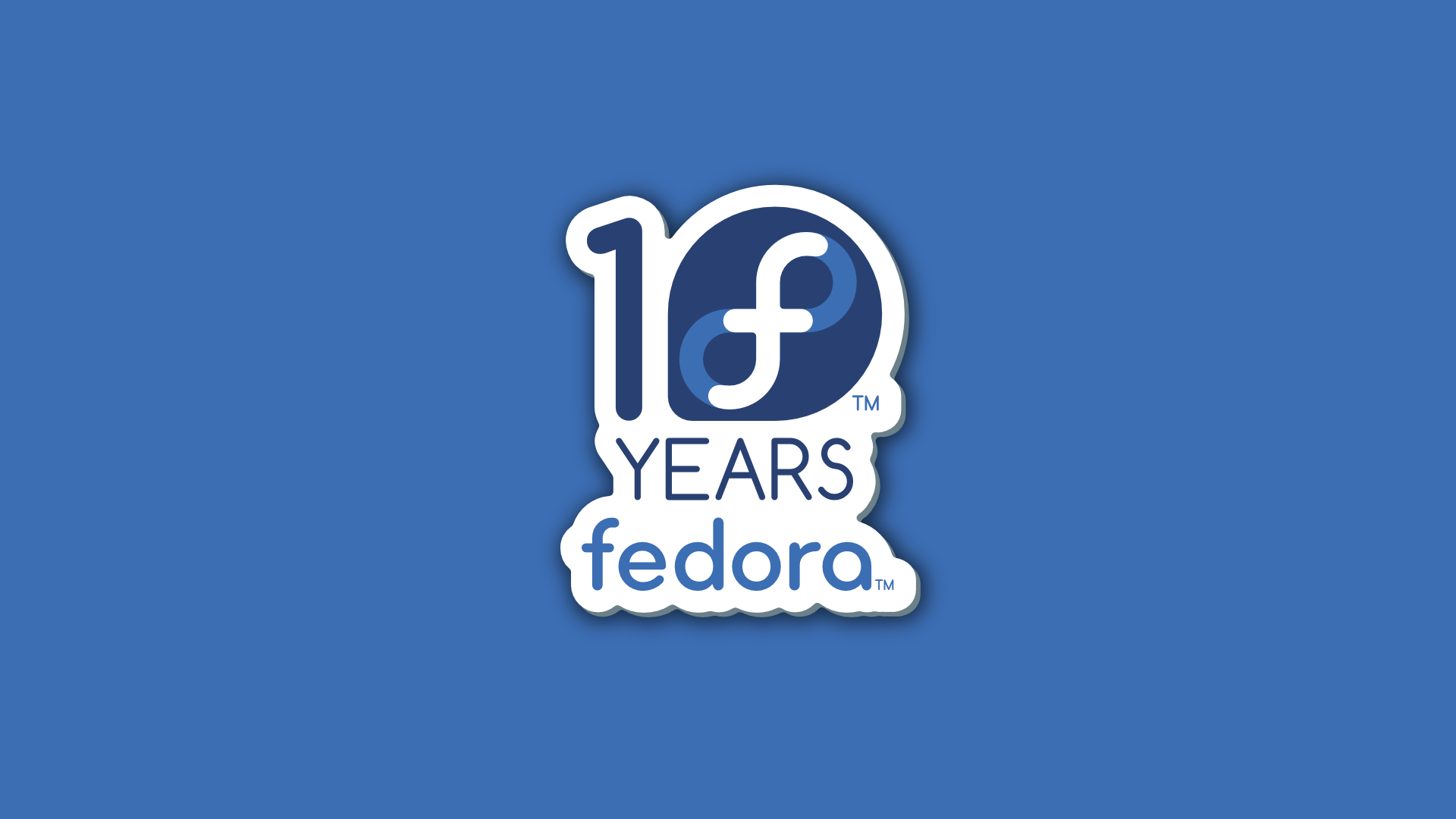
> Here's one idea I had. I don't know if it's too
retro-looking though:
>
> http://i.imgur.com/BjOld.png
This sure is looking nice, I like the general design idea
(white thick
border around everything and subtle shadow), it's not retro at
all, I'd
say the opposite (it seems this kind of typesetting design is
used in
current anime a lot, for example). Maybe try some blur on the
shadow?
(or is that dark blue "border" supposed to create a 3D effect
instead of
shadow?). Or play a little with pronouncing more 3D feel
(flat, but
thick sing) + a subtle drop shadow.
Here's the idea quickly sketched:
http://mso.fedorapeople.org/designs/10years/fedora-10-year.png
http://mso.fedorapeople.org/designs/10years/fedora-10-year.svg
One thing slightly bothers me though -- the "10" looks like a
snail when
0 is rendered as fedora logo... That's not giving out exactly
positive
message ;-)
I took it and played a little bit with it in blender. Thats what came
out so far
https://www.dropbox.com/s/wjr4m468x3rm8mk/4.avi
Its not finished, it needs a lot of improvements. The logo itself
looks to flat, still search for a material which looks not boring.
Light streak on the end needs to improved but that will take some time
br gnokii
@Gnokii,
Good morning. have you found a way round the flat logo? I did. I've
been pinging at #fedora-design. The answer still lies in the bevel
parameter under curve properties.
I'm creating another animation. Mine is actually a 2D draft. Stay
tuned.
Regards
twohot