
2:46 a.m.
Hi ,
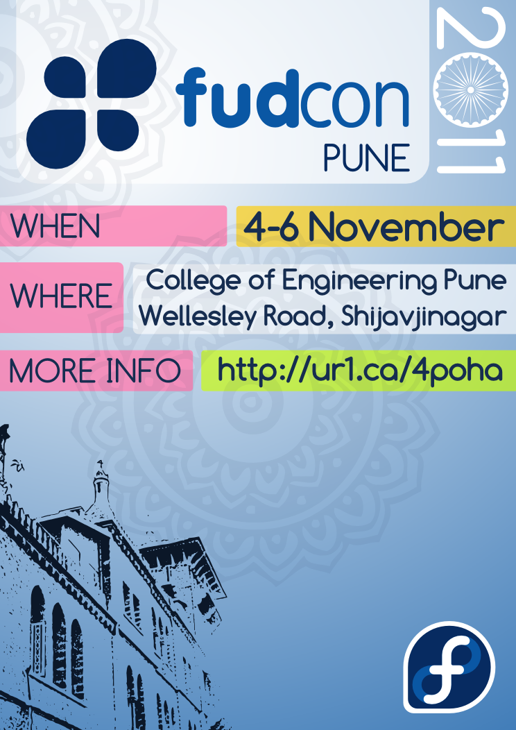
According to your suggestions and guidelines on my blogpost [1], I
have made another incomplete revision of the poster [2]. Its source is
at [3] (I've tried to follow almost all the guidelines you laid out.
The lower area is empty just as my mind has been wiped clean of ideas
for a while :) Please do something on it if possible. I've CCd it to
tatica and design list too.
[1] http://suchakra.wordpress.com/2011/07/16/fudcon-india-2011-design-updates...
[2] http://suchakra.fedorapeople.org/fudcon-designs/poster_fudcon_india_conce...
[3] http://suchakra.fedorapeople.org/fudcon-designs/poster_fudcon_india-revA.svg
Suchakra

4:57 a.m.
Hello,
According to your suggestions and guidelines on my blogpost [1], I
have made another incomplete revision of the poster [2]. Its source is
at [3] (I've tried to follow almost all the guidelines you laid out.
The lower area is empty just as my mind has been wiped clean of ideas
for a while :) Please do something on it if possible. I've CCd it to
tatica and design list too.
[1]
http://suchakra.wordpress.com/2011/07/16/fudcon-india-2011-design-updates-
1/#comments [2]
http://suchakra.fedorapeople.org/fudcon-designs/poster_fudcon_india_concep
t_revA.png [3]
http://suchakra.fedorapeople.org/fudcon-designs/poster_fudcon_india-revA.s
vg
ur first version was definitly better because it was simpler.
When u make a poster start with an eyecatcher. Work with signal colors or an
high contrast.
What I doing always is I step a few steps away from the computer and look at
it. Look what ur eyes fetch first and if they get attention on the poster.
My eye looks first to the fedora sign ;) Why the contrast brings it forward. I
like ur pattern that u added in the last 2 versions, I had a similar thing in
mind working on a shirt design. Like definitly to idea to use the state sign
of india in the font.
But now is the attention from the headline gone.
Next dont overfill a poster with information. Important are the 5 W nothing
more sometimes lesser then 5
What
When
Where
Who
Why
last one, we dont need in that case. Put that information also very visible on
the poster. With so few letters as possible, so dont add "Where" or such
really written.
The line with "MORE INFO" is secondary information. Ask u self would u
remember the short url? No u have to write it down or stay for a while for
remembering it.
When u have a viewer taken to do this, u can write it smaller and set it to
the bottom, he will find it.
I hope that information helps u
br gnokii
Suchakra
_______________________________________________
design-team mailing list
design-team(a)lists.fedoraproject.org
https://admin.fedoraproject.org/mailman/listinfo/design-team
4666
days inactive
4666
days old
design-team@lists.fedoraproject.org
1 comments
2 participants
participants (2)
-
 Sirko Kemter
 -
 Suchakra